The DH Experience Game on Vimeo

We have put up a video of the The DH Experience Game on Vimeo in the INKE Vimeo channel.

John Montague and Luciano Frizzera have designed a cool game that allows people to play at collaboratively completing digital humanities projects. We are now working with GO::DH to make the centers and projects real ones from around the world.

Fragmented Memory | Phillip Stearns

From Elijah Meeks’ hackathon at the Texas Digital Humanities Conference I learned about Fragmented Memory by Phillip Stearns. This is a project that takes binary data and then turns it into weaving instructions using Processing. Here is one of the large tapestries woven (and available for sale.)

If you can’t afford a $15,000 tapestry, there are also cheaper blankets here.

I’ve just put them on my Christmas list (which I can never find in time.)

Front Row to Fashion Week – NYTimes.com

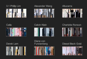
The New York Times has an interesting way of visualizing fashion that you can see in their article Front Row to Fashion Week – Interactive Feature. They have abstracted the colour hues to create small swatches of different designers who showed at the New York Fashion Week. These “sparklines” or sparkboxes are an interesting way to compare the shows by designers.

Blended Learning Award for GWrit

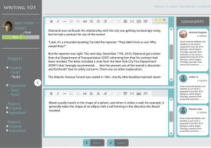
The Game of Writing (Gwrit) project that I am part of just got support through a University of Alberta Blended Learning Award. See the 2014 Selected Courses. This award is going towards creating a flipped version of Writing 101, a service course that is being scaled up to support large sections by Roger Graves and Heather Graves. With the Blended Learning Award support from the Centre for Teaching and Learning and with Faculty of Arts funding we are redeveloping GWrit to be used in large sections of Writing 101. Here is part of the abstract of the proposal,

Research suggests that by creating a rich online environment for students to connect and interact with instructors and peers they can improve as writers. We are currently building a gamified online writing environment, The Game of Writing (GWrit), for Writing Studies 101 (WRS 101) that can support student writers and alumni. WRS 101 is a high demand service course required for many degree programs across the University. We are creating a large class version that blends face-to-face with gamification strategies. In GWrit students will choose and work on assignments or quests that are part of the course. Their progress on these assignments or quests will be shared with peers and instructional staff; in this way all students can see who is working on the same quests, and they can ask for help or advice from them. Informal assessment will be available online from peers in the class; from paid peer tutors; from GTAs; and from alumni. This represents a significant expansion of the informal assessment available in traditional face-to-face courses, where peers and sometimes the instructor give informal feedback. We also intend to invite alumni to post assignments/quests that come from a workplace writing context. Students who complete WRS 101 will continue to have access to GWrit throughout their undergraduate careers and as alumni.

GWrit started as a prototype developed with support from GRAND. The original idea was an open writing environment where folks could challenge each other to compete at writing and where you could get analytics on your writing (number of words written, tasks completed, and visualizations like word clouds.) This research prototype is now being completely redeveloped by the Arts Resource Centre as a learning tool that can be used by students of our courses. We are adding commenting features so that students (and later alumni) can provide writing guidance in a structured fashion.

Interpreting the CSEC Presentation: Watch Out Olympians in the House!

The Globe and Mail has put up a high quality version of the CSEC (Communications Security Establishment Canada) Presentation that showed how they were spying on the Brazilian Ministry of Mines and Energy. The images are of slides for a talk on “CSEC – Advanced Network Tradecraft” that was titled, “And They Said To The Titans: «Watch Out Olympians In The House!»”. In a different, more critical spirit of “watching out”, here is an initial reading of the slides. What can we learn about how organizations like CSEC are spying on us? What can we learn about how they think about their “tradecraft”? What can we learn about the tools they have developed? What follows is a rhetorical interpretation.

Continue reading Interpreting the CSEC Presentation: Watch Out Olympians in the House!

▶ Perseus Digital Library: Diachronic View

Perseus Digital Library Diachronic View is a YouTube video put together by Mihaela as part of a project we are working on as part of INKE. We started asking about the evolution of digital humanities interfaces which then led us to asking if there were projects that have been around long enough that their interfaces may have changed. This led us to the Perseus project which existed before the web. Using the Internet Archive and other sources we tried to reconstitute a history of major versions of the interface from the first HyperCard interface. We then created this video to show the evolution. We are now collaborating with Perseus to study the evolution of their interface, to preserve key screens, and to improve the interface for mobile devices.

The Old Bailey Datawarehousing Interface

The latest version of our Old Bailey Datawarehousing Interface is up. This was the Digging Into Data project that got TAPoR, Zotero and Old Bailey working together. One of the things we built was an advanced visualization environment for the Old Bailey. This was programmed by John Simpson following ideas from Joerg Sanders. Milena Radzikowska did the interface design work and I wrote emails.

One feature we have added is the broaDHcast widget that allows projects like Criminal Intent to share announcements. This was inspired partly by the issues of keeping distributed projects like TAPoR, Zotero and Old Bailey informed.

Google Art Project

An article in the New York Times led me to the Google Art Project. This project doesn’t feel like a Google project, perhaps because it uses an off-black background and the interface is complex. The project brings together art work and virtual tours of many of the worlds important museums (but not all.0 You can browse by collection, artist (by first name), artworks, and user galleries. You can change the language of the interface (and it seems to change even when you don’t want it to in certain circumstances.) When viewing a gallery you can get a wall of paintings or a street view virtual tour of the gallery. Above you see the “Museum View” of a room in the Uffizi with a barrier around a Filippino Lippi that is being treated for a woodworm infestation! In the Museum View you can pan around and move up to paintings much as you would in Google Maps in Street View. On the left is a floor plan that you can also use.
This site reminds me of what was one of the best multimedia CD-ROMs ever, the Musee d’Orsay: Virtual Visit. This used QuickTime VR to provide a virtual tour. It had the sliding walls of art. It also had special guides and some nice comparison tools that let you get a sense of the size of a work of art. The Google Art Project feels loosely copied from this right down to the colour scheme. It will be interesting to see if the Google Art Project subsumes individual museum sites or consortia like the Art Museum Image Consortium (Amico.)

I find it interesting how Google is developing specialized interfaces for more and more domains. The other day I was Googling for movies in Edmonton and found myself on a movies – Google Search page that arranges information conveniently. The standard search interface is adapting.

How Star Trek artists imagined the iPad… 23 years ago

How Star Trek artists imagined the iPad… 23 years ago is an article in Ars Technica about the design of the iconic Star Trek interfaces from those of PADDs (Personal Access Display Devices) to the touch screens used on the bridge. It turns out that one of the reasons for the flat touch screen interfaces was that they were cheap (compared to panels with lots of switches as contemporary spacecraft had.)

What could be simpler to make than a flat surface with no knobs, buttons, switches, or other details? Okuda designed a user interface dominated large type and sweeping, curved rectangles. The style was first employed in Star Trek IV: The Voyage Home for the Enterprise-A, and came to be referred to as “okudagrams.” The graphics could be created on transparent colored sheets very cheaply, though as ST:TNG progressed, control panels increasingly used video panels or added post-production animations.