The Isolator, A Bizarre Helmet For Encouraging Concentration (1925)

From Geoff I learned about The Isolator, A Bizarre Helmet For Encouraging Concentration (1925). The Isolator was developed in 1925 by Hugo Gernsback a science fiction pioneer (and editor of Science and Invention magazine.) The idea is to force you to focus on your writing (with lots of oxygen.)

One wonders if it works? Could it be even more useful now?

Buxton Collection of Input Devices

PivotViewer

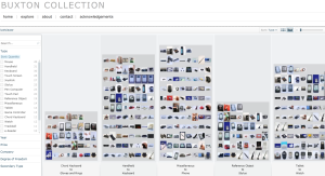
Bill Buxton has made available his collection his Buxton Collection of Interactive Devices. This collection of input and touch devices like chord keyboards, watches, pen computers, and joysticks. I saw some of his collection when at GRAND in 2011 as he mounted a display for CHI 2011 which took place right before.

What is doubly interesting is the Microsoft Silverlight PivotViewer which is for exploring large sets of visual objects. You can explore the Buxton Collection with Pivot if you install Silverlight. Apparently Pivot is discontinued, but you can still try it on the Buxton Collection.

The interface of the PivotViewer reminds me of Stan Ruecker’s work on rich prospect browsing. He developed an interface that always keeps the full set of objects in view while drawing some forward and minimizes others.

Fragmented Memory | Phillip Stearns

From Elijah Meeks’ hackathon at the Texas Digital Humanities Conference I learned about Fragmented Memory by Phillip Stearns. This is a project that takes binary data and then turns it into weaving instructions using Processing. Here is one of the large tapestries woven (and available for sale.)

If you can’t afford a $15,000 tapestry, there are also cheaper blankets here.

I’ve just put them on my Christmas list (which I can never find in time.)

Digital Humanities Quarterly: April Fools 2014

Julia Flanders, Editor in Chief of DHQ, played a great joke on all of us for April Fools. She sent around a message that started with,

DHQ is pleased to announce an experimental new publication initiative that may be of interest to members of the DH and TEI community. As of April 1, we will no longer publish scholarly articles in verbal form. Instead, articles will be processed through Voyant Tools and summarized as a set of visualizations which will be published as a surrogate for the article. The full text of the article will be archived and will be made available to researchers upon request, with a cooling-off period of 8 weeks. Working with a combination of word clouds, word frequency charts, topic modeling, and citation networks, readers will be able to gain an essential understanding of the content and significance of the article without having to read it in full.

On April 1st, 2014, if you went to Digital Humanities Quarterly: 2014 you would have been able to access Voyant versions of the papers of the recent that are there. Stephen Davis on the TEI list logically took it a step further and wrote that he had processed the message itself through Voyant and that the “derived Cirrus word cloud really does say as much (as) anyone need to know about DHQ’s new approach!” Alas the word cloud wasn’t included, so I generated one and here it is.

 

What else is there to say?

A Short History of the Highrise

The New York Times and the National Film Board (of Canada) have collaborated on a great interactive A Short History of the Highrise. The interactive plays as a documentary that you can stop at any point to explore details. The director, Katerina Cizek, on the About page talks about their inspiration:

I was inspired by the ways storybooks have been reinvented for digital tablets like the iPad. We used rhymes to zip through history, and animation and interactivity to playfully revisit a stunning photographic collection and reinterpret great feats of engineering.

For the NFB this is part of their larger Highrise many-media project.

Building Inspector by NYPL Labs

The New York Public Library has another cool digital project called the Building Inspector. They are crowdsourcing the training and correction of a building recognition tool that is combing through old maps. You see a portion of a map with red dots outlining a building and you click “Yes” (if the outline is correct), “No” (if it is wrong), and “Fix” (if it is close, but needs to be fixed.)

They also have a neat subtitle to the project, “Kill Time. Make History.”

The Wedding Data: What Marriage Notices Say About Social Change

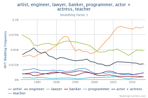
Reading a collection of stories in the Atlantic about women and technology I came across a story about The Wedding Data: What Marriage Notices Say About Social Change. This article talks about Weding Crunchers – a database of New York Times wedding announcements since 1981 that you can search in an environment much like Google’s Ngram viewer. In the chart above you can see that I searched for different professions. Note how “teacher” takes off, probably because of the popularity of Teach for America.

I can’t help wondering if we are seeing the emergence of a genre of text visualization – the diachronic word viewer. This type of visualization depends on an associations between orthographic words (the actual words in texts) and concepts.

The Cube at QUT – world’s biggest multitouch installation

Luciano sent me this link to a stunning multipoint touch installation at Queensland University of Technology, Brisbane, The Cube at QUT – world’s biggest multitouch installation. I like how they have the touch at ground level, but the screen extends up.

I note that the Cube folk also have a Lego Education Learning Centre. I’m doubly envious.