Like most profs I have had to deal with plagiarism cases. Over the years I have become convinced that the problem is not the odd cheater, but students who have developed habits. My hypothesis is:
Prepatory colleges in Canada that prepare foreign students for acceptance to Canadian universities are a breeding ground for writing coping tactics. Students who go to these schools unprepared for high school writing in English, learn from their peers a collection of tactics that let them get by. Because of the family pressure to succeed and the short time they have to learn to write in English, they have to avail themselves of these tactics and don’t feel they have the luxury of really trying to write in their own voice. We make matters worse by, on the one hand threatening them with expulsion if caught, and on the other hand offering no real alternative tactics or writing courses with individual attention in the first year. Further I suspect that:
- Students know that plagiarism is an integrity issue, but are more scared of failure. Even if students don’t understand all the nuances of plagiarism they know they can’t write the way they can in their native language.
- Students fool themselves by thinking it doesn’t matter for the moment, or that this is what everyone does, or that they will learn it later.
- We fool ourselves into thinking that it does matter in the work world the way it does to us when, in fact, in many situations a report cribbed off the web that answers questions is good enough. There is even software to support such cribbing, see Net Snippets.
- Students in this situation don’t trust staff or their professors to help them as they are committed to coping tactics and don’t have the oral communication skills to get navigate help without admitting they are doing something they know is wrong.
- Students are using a variety of tactics and find it easier to modulate tactics or acquire new ones than to start writing. These vary from collaborating to buying essays.
- These tactics are successful at getting passing grades on writing assignments.
- Native English writers are a very different problem and interventions aimed at them won’t work with ESL students. Most plagiarism modules are aimed at native writers.
ESL and native writers have realized that in the economics of education it costs under $100 to buy a cust written 5-page paper that will not get caught and will get a B for the assignment. This is less than the cost of textbooks for a course.
In short, with ESL students we are dealing with habits formed before they come to university and habits are not changed the way exceptional behaviour is. Habits are changed by understanding them, understanding the triggers, providing alternative tactics, and motivating students to try alternatives.
A good site on plagiarism is, Assessing Student Learning – five practical guides from the University of New South Wales. PLAGUE is a special interest group based at Monash University who are researching the issue. See their papers and links.
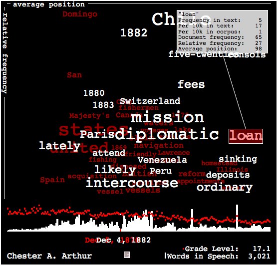 Brad Borevitz of onetwothree.net has developed another visualization of language in presidential State of the Union Addresses at State of the Union. He calls it a “data toy” and it combines a number of different graphs. One nice feature is that if you click on one Address and then another the word cloud for the first appears behind (and in red) the second for comparison purposes.
 The
The 
 ThinkGeek has a T-shirt with the blog version of the “cogito” that Joanne thinks should be mine. See