Harvard and Open Access

Peter Suber in Open Access News has reproduced the text of the motion that the Faculty of Arts and Science at Harvard passed requiring faculty to deposit a copy of their articles with the university.

The Faculty of Arts and Sciences of Harvard University is committed to disseminating the fruits of its research and scholarship as widely as possible. In keeping with that commitment, the Faculty adopts the following policy: Each Faculty member grants to the President and Fellows of Harvard College permission to make available his or her scholarly articles and to exercise the copyright in those articles.

According to another post by Peter Suber, Harvard is the first North American university to adopt an open access policy. He calls it a “permission mandate” (granting permission to the university to make research open) rather than a “deposit mandate.” It has the virtue that the university takes responsibility for maintaining the access, not the faculty member.

More on this can be found here (another Suber post) and here (Chronicle of Higher Ed.).

Notes from the Walter Ong Collection » Blog Archive » Defining the Humanities for Congress

I came across a long quote from Walter Ong in 1978 when he was president of the MLA – Defining the Humanities for Congress. It is interesting to look back at this and how clearly Ong saw the humanities and technology.

The humanities depend on writing and on print as well as, less directly, on newer media and although oral speech, on which all verbal communication is always ultimately based, is not a technology, writing, print, and the electronic media are all technological developments. The printing press constituted the first assembly line. The humanities need technology.

However, if the humanities need technology, technology also needs the humanities. For technology calls for more than technological thinking, as our present ecological crises remind us. Technology demands reflection on itself in relation to the entire human life world. Such reflection is no longer merely technology, it includes the humanities even though it needs to be done especially by scientists and technologies.

See also the Technology category of this Notes from the Walter Ong Collection. I particularly like the quote “Nothing is more human than artifice.

The Spectator’s View of Web Standards

One of my favourite software writers/bloggers is Joel Spolsky: he is thoughtful, funny, and knows how to tell a story. Yesterday he posted a longer-than-usual disquisition on the upcoming web-standards smackdown that will follow on the heels of the release of Internet Explorer 8.

My sympathies tend to fall with the standards purists (though the need to deliver a product forces me to appreciate compromise), I find the elegance of good abstraction irresistible and standards compliant design makes for more stable, comprehensible, editable and elegant sites (from the perspective of the developer, that is: I’m saying nothing about how anything looks to the actual eye…). And there’s a large and vocal community that shares this attitude. The nagging voice of reason, however, (and I am only assuming it is the voice of reason, I haven’t mentioned this to a psychiatric professional) does frequently ask “Is this semantic markup?” The practical distinction between ‘presentation’ and ‘logic’ only looks clear from the periphery; the middle ground is big and grey and muddy.

So, Joel’s remarks on the casual meaning of ‘standards’ when applied to web development are, I think, appropriate, and his story illustrating the history of incremental standards compromise in the service of progress is undeniable (except, perhaps, to a fanatical idealist). His pragmatic arguments that 1) there is no practical web-standard benchmark against which to measure browser compliance, 2) that the expression of standards specifications in W3C documentation are frequently impenetrable, and 3) that Microsoft like any other company has to maintain the good will of their existing customers by supporting legacy products and document formats in new products, are all well argued and substantially acceptable. It is almost enough to make me feel some sympathy for Microsoft. Almost.

Of course, talking about IE is not quite like talking about Word, where the evolution of the document format is bound to the product alone; any web developer will ask why there are so many fewer discrepancies found on a first test of a site architecture between FireFox, Safari, and Opera than between any of these and IE6 (indeed, a measure of the improvement in standards compliance of IE7 is that there may now be more discrepancy between IE6 and IE7 than between IE7 and the other major browsers (maybe)). Surely at least some of the blame for the whole fracas with respect to IE and the rise of web standards fanaticism rests with Microsoft’s historical unwillingness to accept any general standards not of their own making. (Witness ODF vs OOXML as just one example.)

I’ll stop there and leave the flaming for other, more capable participants. In the end, one can’t really disagree with Joel’s point that the demand by compliance fanatics within Microsoft (I know, the very idea of their existence leaves me a little breathless) that IE8 be so rigid in it’s adherence to standards based code that only 37% (or whatever number…) of existing web pages will accurately render is just silly. The plea one wants to make is for the middle path: too much unpredictability in a platform will hinder development and so will too much inflexibility: the question is “how much is too much?”. We complain about caprice in the rendering decisions of various browsers (some more than others), but it is almost certainly a good thing that we are required to reinvent from time to time; the human impulse is to improvise and the best measure of our ingenuity is our capacity to swede the world. (Well, I liked the “be kind, rewind” site so much I had to work it in somewhere.)

Sweding: Be Kind Rewind

Screen Image
And now for the best movie web site I’ve seen in a long time, Be Kind Rewind. The premise is that the web is erased (by Jack Black, presumably) and various other web sites have to be sweded, which has something to do with coming from Sweden (and “sweet”?). There is a two page PDF that explains it all and examples like a swede Google. It looks like paper reverse engineering of a web design.

Thanks to Calen for this.

Zielinski: Deep Time of the Media

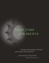
Image of Cover Siegried Zielinski’s Deep Time of the Media (translated by Gloria Custance, Cambridge, MA, MIT Press, c2006) is an unusual book that pokes into the lost histories of media technologies in order to start “toward an archaeology of hearing and seeing by technical means” (as the subtitle goes.) Zielinski starts by talking about the usual linear history of media technologies that recovers what predicts what we believe is important. This is the Vannevar Bush, Ted Nelson type of history. Zielinski looks away from the well known precursurs towards the magical and tries to recover those moments of diversity of technologies. (He writes about Gould’s idea of punctuated equilibrium as a model for media technologies – ie. that we have bursts of diversity and then periods of conformity.)

I’m interested in his idea of the magical, because I think it is important to the culture of computing. The magical for Zielinski is not a primitive precursor of science or efficiency. The magical is an attitude towards possibility that finds spectacle in technology. Zielinksi has a series of conclusions that sort of sketch out how to preserve the magical:

Developed media worlds need artistic, scientific, technical, and magical challenges.  (p. 255)

Cultivating dramaturgies of difference is an effective remedy against the increasing ergonomization of the technical media wolrds that is taking place under the banner of ostensible linear progress. (p. 259)

Establishing effective connections with the peripheries, without attempting to integrate these into the centers, can help to maintain the worlds of the media in a state that is open and transformable. (p. 261)

The most important precondition for guaranteeing the continued existence of relatively power-free spaces in media worlds is to refrain from all claims to occupying the center. (p. 269)

The problem with imagining media worlds that intervene, of analyzing and developing them creatively, is not so much finding an appropriate framework but rather allowing them to develop with and within time. (p. 270)

Kairos poetry in media worlds is potentially an efficacious tool against expropriation of the moment. (p. 272)

Artistic praxis in media worlds is a matter of extravagant expenditure. Ist priviledged location are not palaces but open laboratories. (p. 276)

Hoberman: Cathartic User Interface

Image of CUI How can art engage interactivity? Perry Hoberman’s work Cathartic User Interface (1995, 2000) is mentioned in Siegried Zielinski’s Deep Time of the Media as a work that draws attention to the computer interface which is supposed to disappear. The CUI has a rack of keyboards at which viewers can throw balls as if at a carnival. Depending on what input they hit they get different images projected onto the work. For Zielinski, the logic of interface design is to become transparent (so we can do work) and artists like Hoberman remind us that the man-machine symbiosis is not that easy. Hoberman develops “dramaturgies of opposition.”

In an interview in the defunct art orbit, “Loosen Up the Loop”, Perry Hoberman talks about interactivity and seems to be taking issue with Manovich’s view that a painting can be interactive,

“I am happy to argue with anyone who says a painting is interactive because each person thinks different things when they look at it. I think the word becomes meaningless if you use it too broadly.”

Hoberman has a fairly open view of interactivity and nothing resembling an agenda. Rather he deals with the computer with humour, notably through his various alerts. But I could be in error.

Image of Error

The Charms of Wikipedia

The Charms of Wikipedia is a charming review essay about editing the Wikipedia by Nicholson Baker in the New York Review of Books (Volume 55, Number 4 · March 20, 2008). In the review essay he talks John Broughton’s Wikipedia: The Missing Manual, which is just that – a manual for editing the Wikipedia. Baker talks about trying to rescue articles proposed for deletion and concludes with,

My advice to anyone who is curious about becoming a contributor—and who is better than I am at keeping his or her contributional compulsions under control—is to get Broughton’s Missing Manual and start adding, creating, rescuing. I think I’m done for the time being. But I have a secret hope. Someone recently proposed a Wikimorgue—a bin of broken dreams where all rejects could still be read, as long as they weren’t libelous or otherwise illegal. Like other middens, it would have much to tell us over time. We could call it the Deletopedia.

This reminds me of another story about the Wikipedia and its founder, Larry Wales. It turns out that Wales has been dating the bizarre Canadian conservative Rachel Marsden (infamous in Canada for a harassment case with her SFU swim coach.) Wales apparently broke up with her on the Wikipedia and she is retaliating by selling his T-shirt on E-Bay. See the Globe and Mail story, Ms. Marsden’s cyberspace breakup: tit-for-tat-for-T-shirt by Siri Agrell, March 4, 2008. There is a longer article with links to the relevant materials from Fox, titled, Wikipedia Founder’s Fling With Columnist Ends in Nasty Public Breakup. There is some question as to whether he was using his position to sanitize her Wikipedia entry.

High Resolution Visualization

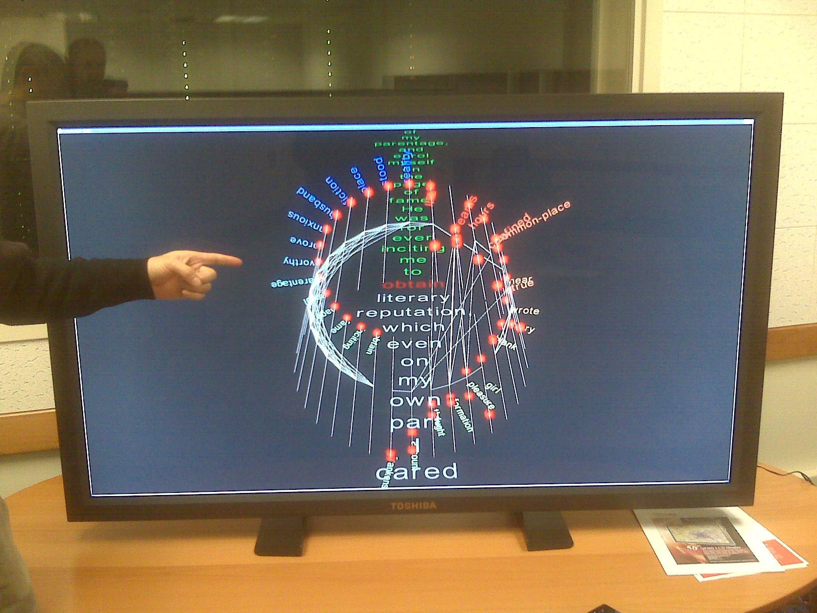
Image of Monitor
In a previous post I wrote about a High Performance Visualization project. We got the chance to try the visualization on a Toshiba high resolution monitor (something like 5000 X 2500). Above you can see a picture I took with my Blackberry.

What can we do with high resolution displays? What would we show and how could we interact with them? I take it for granted that we won’t just blow up existing visualizations.

Obama and the Long Tail fo Politics

I went to a talk by David Theo Goldberg who also heads up the UCHRI (University of California Humanities Research Institute). His talk wasn’t about networked politics, but he repeatedly mentioned flash mobs as a new political phenomenon and then he went on to praise the long blog entry Barack Obama and The Long Tail of Politics by Isaac Garcia of Central Desktop, the company whose wiki-like collaboration software was used by Obama to organize California. The blog entry is one of the best explanations of the Obama phenomenon I’ve come across.