Digital Humanities Quarterly: April Fools 2014

Julia Flanders, Editor in Chief of DHQ, played a great joke on all of us for April Fools. She sent around a message that started with,

DHQ is pleased to announce an experimental new publication initiative that may be of interest to members of the DH and TEI community. As of April 1, we will no longer publish scholarly articles in verbal form. Instead, articles will be processed through Voyant Tools and summarized as a set of visualizations which will be published as a surrogate for the article. The full text of the article will be archived and will be made available to researchers upon request, with a cooling-off period of 8 weeks. Working with a combination of word clouds, word frequency charts, topic modeling, and citation networks, readers will be able to gain an essential understanding of the content and significance of the article without having to read it in full.

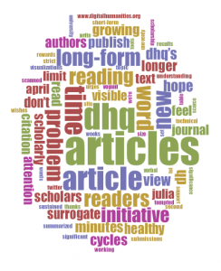
On April 1st, 2014, if you went to Digital Humanities Quarterly: 2014 you would have been able to access Voyant versions of the papers of the recent that are there. Stephen Davis on the TEI list logically took it a step further and wrote that he had processed the message itself through Voyant and that the “derived Cirrus word cloud really does say as much (as) anyone need to know about DHQ’s new approach!” Alas the word cloud wasn’t included, so I generated one and here it is.


What else is there to say?

Humanities Visualization Service at Texas

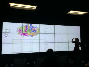
Texas A&M University held a Humanities Visualization Service Grand Opening at the Initiative for Digital Humanities, Media, and Culture. One of the visualizations they showed used Voyant (see above.) It is interesting to think about how visualizations should be designed for large screens seen by groups of people. With others I presented on this subject at the Chicago Colloquium – see The Big See: Large Scale Visualization. I am not convinced that very high-resolution screens/projectors and tiled data walls (like what they have at the IDHMC) will become the norm. We need to develop visualization tools so that they can scale up to walls and for groups.

Text classification tool on the web


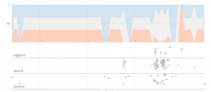
Michael pointed me to a story about how Stanford scientists put free text-analysis tool on the web. The tool allows you to pass a text (or a Twitter hashtag) to an existing classifier like the Twitter Sentiment classifier. It then gives you a interactive graph like the one above (which shows tweets about #INKEWhistler14 over time.) You can upload your own datasets to analyze and also create your own classifiers. The system saves classifiers for others to try.

I’m impressed at how this tool lets people understand classification and sentiment analysis easily through Twitter classifications. The graph, however, takes a bit of reading – in fact, I’m not sure I understand it. When there are no tweets the bars go stable, and then when there is activity the negative bar seems to go both up and down.

How Netflix Reverse Engineered Hollywood

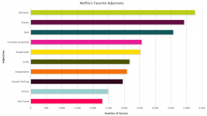
Alexis C. Madrigal has a fine article in The Atlantic on How Netflix Reverse Engineered Hollywood (Jan. 2, 2014). The article moves from an interesting problem about Netflix’s micro-genres, to text analysis of results of a scrape, to reverse engineering the Netflix algorithm, to creating a genre generator (at the top of the article) and then to an interview with the Netflix VP of Product who was responsible for the tagging system. It is a lovely example of thinking through something and using technology when needed. The text analysis isn’t the point, it is a tool to use in understanding the 76,897 micro-genres uncovered. (Think about it … Netflix has over 70,000 genres of movies and TV shows, some with no actual movies or shows as examples of the micro-genre.)

Madrigal goes on to talk about the procedure Netflix uses to create genres and use them in recommending shows. It turns out to be a combination of content analysis (actual humans watching a movie/show and ranking it in various ways) and automatic methods that combine tags. This combination of human and machine methods is also the process Madrigal describes for his own pursuit of Netflix genres. It is another sense of humanities computing – those procedures that involve both human and algorithmic interventions.

The post ends with an anomaly that illustrates the hybridity of procedure. It turns out the most named actor is Raymond Burr of Perry Mason. Netflix has a larger number of altgenres with Raymond Burr than anyone else. Why would he rank so high in micro-genres? Madrigal tries a theory as to why this is that is refuted by the VP Yellin, but Yellin can’t explain the anomaly either. As Madrigal points out, in Perry Mason shows the mystery is always resolved by the end, but in the case of the mystery of Raymond Burr in genre, there is no revealing bit of evidence that helps us understand how he rose in the ranks.

On the other hand, no one — not even Yellin — is quite sure why there are so many altgenres that feature Raymond Burr and Barbara Hale. It’s inexplicable with human logic. It’s just something that happened.

I tried on a bunch of different names for the Perry Mason thing: ghost, gremlin, not-quite-a-bug. What do you call the something-in-the-code-and-data which led to the existence of these microgenres?

The vexing, remarkable conclusion is that when companies combine human intelligence and machine intelligence, some things happen that we cannot understand.

“Let me get philosophical for a minute. In a human world, life is made interesting by serendipity,” Yellin told me. “The more complexity you add to a machine world, you’re adding serendipity that you couldn’t imagine. Perry Mason is going to happen. These ghosts in the machine are always going to be a by-product of the complexity. And sometimes we call it a bug and sometimes we call it a feature.”

Perhaps this serendipity is what is original in the hybrid procedures involving human practices and algorithms? For some these anomalies are the false positives that disrupt big data’s certainty, for others they are the other insight that emerges from the mixing of human and computer processes. As Madrigal concludes:

Perry Mason episodes were famous for the reveal, the pivotal moment in a trial when Mason would reveal the crucial piece of evidence that makes it all makes sense and wins the day.

Now, reality gets coded into data for the machines, and then decoded back into descriptions for humans. Along the way, humans ability to understand what’s happening gets thinned out. When we go looking for answers and causes, we rarely find that aha! evidence or have the Perry Mason moment. Because it all doesn’t actually make sense.

Netflix may have solved the mystery of what to watch next, but that generated its own smaller mysteries.

And sometimes we call that a bug and sometimes we call it a feature.
WPA: Uses and Limitations of Automated Writing Evaluation

The Council of Writing Program Administrators has made available a very useful Research Bibliography on the Uses and Limitations of Automated Writing Evaluation Software (PDF). This is part of a set of WPA-ComPile Research Bibliographies. There are paragraph long summaries of the articles that are quite useful.

What seems to be missing is an ethical discussion of automated evaluation. Do we need to tell people if we use automated evaluation? Writing for someone feels like a very personal act (even in a large class). What are the expectations of writers that their writing would be read?

Kindred Britain

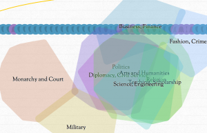
Susan alerted me to an interesting interactive of Kindred Britain that lets you see how different luminaries in British history are connected. This interactive is difficult to use at first. You should really go though the tutorial that opens immediately as the visualizations and controls are not obvious. Once you do you are rewarded with a three layered visualization:

  • Network
  • Timeline, and
  • Geography

These layers are linked so manipulating one changes things in the others. The authors have written essays on what they did.

Interpreting the CSEC Presentation: Watch Out Olympians in the House!

The Globe and Mail has put up a high quality version of the CSEC (Communications Security Establishment Canada) Presentation that showed how they were spying on the Brazilian Ministry of Mines and Energy. The images are of slides for a talk on “CSEC – Advanced Network Tradecraft” that was titled, “And They Said To The Titans: «Watch Out Olympians In The House!»”. In a different, more critical spirit of “watching out”, here is an initial reading of the slides. What can we learn about how organizations like CSEC are spying on us? What can we learn about how they think about their “tradecraft”? What can we learn about the tools they have developed? What follows is a rhetorical interpretation.

Continue reading Interpreting the CSEC Presentation: Watch Out Olympians in the House!

Wikileaks – The Spy files

On December 1st, 2011 Wikileaks began releasing The Spy files, a collection of documents from the intelligence contractors. These documents include presentations, brochures, catalogs, manuals and so on. There are hundreds of companies selling tools to anyone (country/telecom) who wants to spy on email, messaging and phones. I find fascinating what they should about the types of tools available to monitor communications, especially the interfaces they have designed for operatives. Here are some slides from a presentation by Glimmerglass Networks (click to download entire PDF).

Continue reading Wikileaks – The Spy files

Rap Game Riff Raff Textual Analysis

Tyler Trkowski has written a Feature for NOISEY (Music by Vice) on Rap Game Riff Raff Textual Analysis. It is a neat example of text analysis outside the academy. He used Voyant and Many Eyes to analyze Riff Raff’s lyrical canon. (Riff Raff, or Horst Christian Simco, is an eccentric rapper.) What is neat is that they embedded a Voyant word cloud right into their essay along with Word Trees from Many Eyes. Riff Raff apparently “might” like “diamonds” and “versace”.

HedgeChatter – Social Media Stock Sentiment Analysis Dashboard

HedgeChatter – Social Media Stock Sentiment Analysis Dashboard is a site that analyzes social media chatter about stocks and then lets you see how a stock is doing. In the picture above you can see the dashboard for Apple (APPL). Rolling over it you can see what people are saying over time – what the “Social Sentiment” is for the stock. I’m assuming with an account one can keep a portfolio and perhaps get alerts when the sentiment drops.

To do this they must have some sort of text analysis running that gives them the sentiment.