According to the Official Google Notebook Blog they are stopping development on the Google Notebook. I rather liked Google Notebook for gathering notes, to do lists, and so on. Google Docs doesn’t have the same ease of use. Oh well, time to find something else.
THRU YOU | Kutiman mixes YouTube
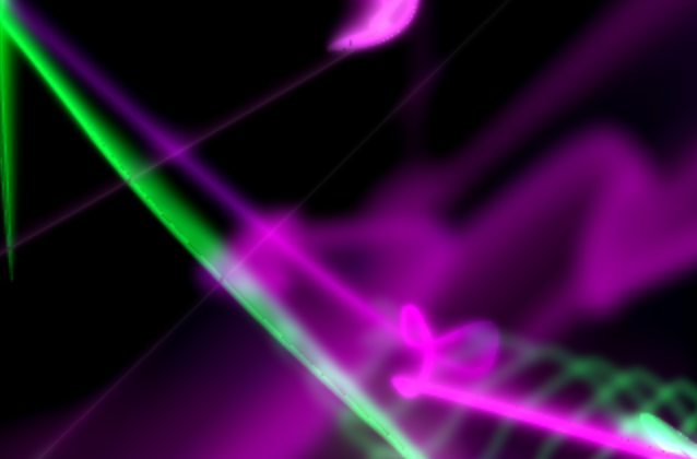
From Peter O and others the amazing YouTube remix, THRU YOU | Kutiman mixes YouTube. Alarmingly good music.
And from Peter R a link to Extreme Sheet LED Herding. Flock remix.
INKE: Implementing New Knowledge Environments
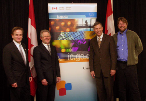
Congratulations to Ray Siemens and company for INKE: Implementing New Knowledge Environments which got funding as a Major Collaborative Research Initiative from SSHRC. I’m part of the Interface Design group led by Stan Ruecker.
The Power Plant: Laurence Weiner
The Globe and Mail has a review of the Lawrence Weiner show at the The Power Plant in Toronto (who must have one of the worst gallery web sites I’ve seen in a long time – lots of navigation for no content in very small type!) e-flux has a better site about the show.
The Globe and Mail article, “Brilliantly maddening word sculptures” by Gary Michael Dault (Thursday, March 19th, 2009, Section R, p. 1) nicely explores the issues around language and art raised by such conceptual work. Dault walked through the show with Weiner and Dault ends the articles with,
We talk about whether language actually means anything at all. “Language does mean something,†Weiner contends gaily, “but not what you thought it meant.†There’s the other side of a cul-de-sac for you.
Weiner’s sculpture with words goes back to the 1960s. His Declaration of Intent (1968) articulates a relationship between instructions for a work of art and the fabricated work.
“1. The artist may construct the piece. 2. The piece may be fabricated. 3. The piece need not be built. Each being equal and consistent with the intent of the artist the decision as to condition rests with the receiver upon the occasion of receivership.”
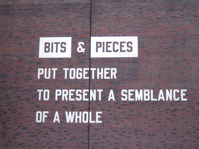
Does it matter if the work is actually put together from bits and pieces? Do the bits and pieces of social media (like the bits of blog entires, or the pictures of words in the Dictionary) make a whole or its semblance?
MIT: Open Access Mandate
From Twitter I found a link to Peter Suber, Open Access News where there is a story of MIT’s unanimous faculty vote to adopt an Open Access mandate that gives the University the right to archive and make available their articles. Like the Harvard mandate, faculty can opt out if they have a good reason.
Each Faculty member grants to the Massachusetts Institute of Technology nonexclusive permission to make available his or her scholarly articles and to exercise the copyright in those articles for the purpose of open dissemination.
Day in the Life of the Digital Humanities – Taporwiki
 Well today is the day of the Day in the Life of the Digital Humanities project. We have about 100 people from around the world blogging what they do for a day as a form of autoethnography of a community. You can follow on the RSS feeds. My Day of DH blog (as opposed to this one) is at http://ra.tapor.ualberta.ca/~dayofdh/GeoffreyRockwell/
Neave Imagination …big wobbly elephants
Neave Imagination (…big wobbly elephants) is a lovely Flash toy that works great on a large screen.
Play with the big wobbly lines and you’ll soon have an active imagination.
Try his other toys – many are beautiful and they work on a 30″ screen.
Beatrice Warde: The Crystal Goblet
Reading the book on Canadian book design, The Surface of Meaning I came across a reference to Beatrice Warde’s The Crystal Goblet. This was given as a lecture in London in 1930 with the title “Printing Should be Invisible” and was printed in the 1950s. It is a clear and apparently influential statement of the modernist view of how a book design should be transparent letting the ideas shine through. It starts with a metaphor of the book as a goblet.
Imagine that you have before you a flagon of wine. You may choose your own favourite vintage for this imaginary demonstration, so that it be a deep shimmering crimson in colour. You have two goblets before you. One is of solid gold, wrought in the most exquisite patterns. The other is of crystal-clear glass, thin as a bubble, and as transparent. …
Bear with me in this long-winded and fragrant metaphor; for you will find that almost all the virtues of the perfect wine-glass have a parallel in typography. …
Now the man who first chose glass instead of clay or metal to hold his wine was a ‘modernist’ in the sense in which I am going to use that term. That is, the first thing he asked of his particular object was not ‘How should it look?’ but ‘What must it do?’ and to that extent all good typography is modernist. …
It is sheer magic that I should be able to hold a one-sided conversation by means of black marks on paper with an unknown person half-way across the world. Talking, broadcasting, writing, and printing are all quite literally forms of thought transference, and it is the ability and eagerness to transfer and receive the contents of the mind that is almost alone responsible for human civilization. …
the most important thing about printing is that it conveys thought, ideas, images, from one mind to other minds. This statement is what you might call the front door of the science of typography. …
Type well used is invisible as type, just as the perfect talking voice is the unnoticed vehicle for the transmission of words, ideas. ..
it is mischievous to call any printed piece a work of art, especially fine art: because that would imply that its first purpose was to exist as an expression of beauty for its own sake and for the delectation of the senses. Calligraphy can almost be considered a fine art nowadays, because its primary economic and educational purpose has been taken away; but printing in English will not qualify as an art until the present English language no longer conveys ideas to future generations, and until printing itself hands its usefulness to some yet unimagined successor. …
The book typographer has the job of erecting a window between the reader inside the room and that landscape which is the author’s words. He may put up a stained-glass window of marvellous beauty, but a failure as a window; that is, he may use some rich superb type like text gothic that is something to be looked at, not through. Or he may work in what I call transparent or invisible typography. …
Printing demands a humility of mind, for the lack of which many of the fine arts are even now floundering in self-conscious and maudlin experiments. There is nothing simple or dull in achieving the transparent page. Vulgar ostentation is twice as easy as discipline.
Perhaps the time comes when printing reluctantly hands off its usefulness to a digital successor like the Kindle which would explain the (re)discovery of pressing form into paper and other arts of the book. I am not making a prediction and especially not recommending this, just reflecting on how the book need not be so transparent as it was supposed to be. When the burden of usefulness is eased off the shoulders of books they can become post-modern chalices, opaque and shiny.
For another take see Book Design in Canada at Cardigan Industries.
Now for the wine within.
Ruecker’s One Minute Movies
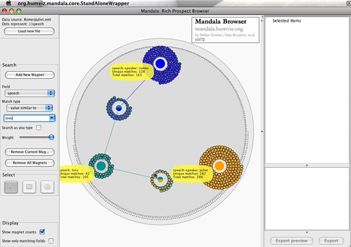
My colleague Stan Ruecker has been create short online movies of humanities computing software tools he is involved in like the Mandala Browser and the Digital Profiles rich prospect browser. These are in the tradition of videos like A Vision of Students Today from the Digital Ethnography folk. There is also the TEI Encoding of Dylan’s Subterranean Homesick Blues. Neat idea – we should get more comfortable with YouTube as a way of conveying ideas.
HASTAC: Digital Textuality and Tools
Over the last few days I’ve been reading and contributing to one of the HASTAC discussion forms on Digital Textuality and Tools. This is led by Angela Kinney and Michael Widner.
Among other things there was a link to an interesting project, Inventoriana for collaborative annotation of manuscript images.