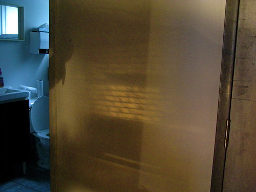
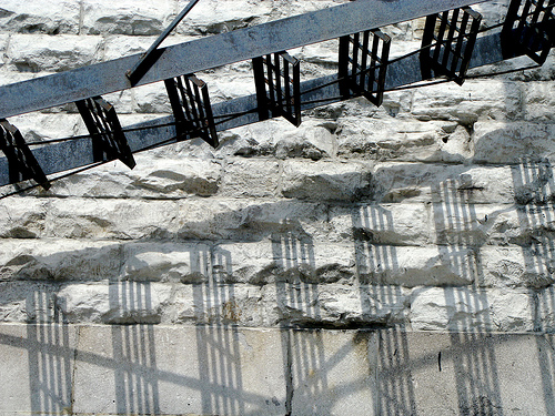
I put a photo set up on Flickr for our Hacking as a Way of Knowing project. The set documents the evolution of the project which I’ve tentatively named the “ReReader for the Writing on the Wall”. Thanks to all those who made the project and the workshop a success. Now I have to think a bit deeper about making as knowing and things as theories.
Category: Photographs
The Journal of Urban Typography
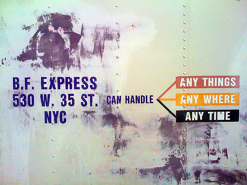
The Journal of Urban Typography is a project like the Dictionary of Words in the Wild that “is dedicated to the documentation and study of signs, word fragments, and typography created with utilitarian intent in urban environments.” Many of the images are beautiful – the author of the site calls it a journal but it is more of an art book. The interface is intriguing as if it were a bunch of polaroids. You can dismiss some and rearrange them. This is built on Tumblr, an online blogging or service that you can adapt to collecting different types of things. Thanks to Peter O for this.
i hardly know her: Flickr view
I Hardly Know Her (IHKH) is an alternative way to view Flickr photostreams that is simple and effective. You just add your account name to “ihardlyknowher.com” – for example, my stream at geoffreyrockwell. Mouseover the images to get info, click to get a bigger one. Thanks to Peter O for this.
Night Danger: Dictionary of Words in the Wild over 3500
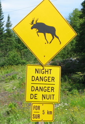
The Dictionary of Words in the Wild has now over 3,500 images and over 4,500 words. Willard McCarty delivered a paper at the University of Western Sydney reflecting on the Dictionary, “Stepping off the edge of the world or into it: The Dictionary of Words in the Wild as research?” Willard is the star contributor, but I’m catching up with pictures taken on the move across Canada including the moose danger sign above which is seen frequently on the Trans-Canada in parts of Ontario and Manitoba.
A Brief History of Neon — New York Magazine
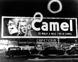
In A Brief History of Neon in New York Magazine I came across reference to Artkraft Strauss one of the first and most important makers of neon signs, ads and marquees. Artkraft Strauss dominated the design of neon signs for Times Square including the new year’s midnight ball-lowering. Artkraft Strauss is still around as a design and consulting company and they have a great archive of images of “100 years of commerce, design and Times Square celebrations”. It is a treasure of neon sign design in New York from the first days.
Two Sets on Flickr
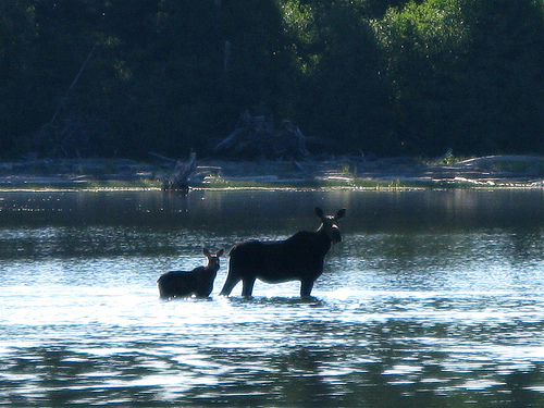
I’ve put up two sets of photos on Flickr. Montreal 2008 is 17 photos taken in Montreal during the Just for Laughs festival. Check out the pose of Professor Rockwell. Pukaskwa is a set taken in Pukaskwa National Park, one of the most beautiful parks to hike, even if the mosquitoes are terrible. Below is picture of the Moose we saw wading out.
Buffalo Again
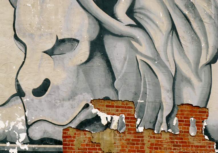 I’ve posted two sets of photos on my Flickr account, Buffalo Again are pictures taken downtown Buffalo. The other set is of silos on the Buffalo waterfront.
Photos: Mexican Grave

I finally got around to putting up a photoset on Flickr of some of the best pictures I took at a graveyard in Playa del Carmen, Mexico – Mexican Grave.
TiltViewer
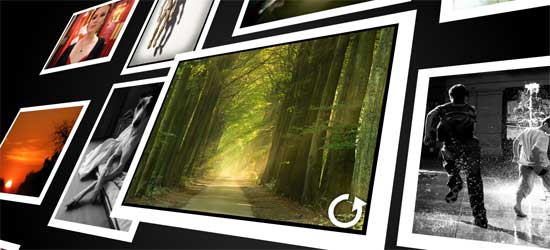 TiltViewer is a fascinating way to look at Flickr pictures. It is by the same guy who created Simpleviewer – a Flash image viewer. I read about this on Shawn’s Randomosity blog.
I’m back and have pictures
 Summer Travels is a Flickr set of some of the best pictures from my month away.
