Hacking as a Way of Knowing – Digital History

Photo

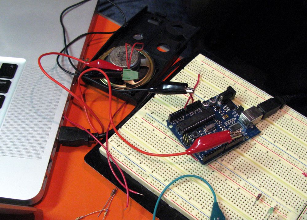
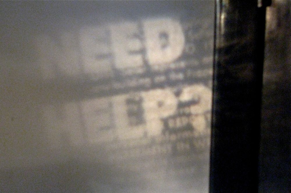
Today was the first day of the Hacking as a Way of Knowing e-waste fabrication workshop. Above you can see the text from a fax thermal printer roll projected onto a wall. (At least I think that’s what it is.) Below is an Arduino connected to a a speaker. Stéfan has working on taking a RSS feed and triggering events so we can connect stuff to it to create cool stuff.

Photo of Arduino

We got talking about why fabrication is taking off. Turkel has his lab. Matt Ratto at the Univerity of Toronto has a lab (with a great name – CriticalMaking.com. Some of the reasons are:

  • There is a growing amount of electronic waste visible and available to be repurposed (and reminding us of how much we waste.)
  • As manufacturing moves out of North America we respond by exploring micro and personal manufacturing through fabrication. It is possible that this is the future of manufacturing here.
  • As manufacturing becomes so complex that we can’t imagine how everyday things are made, fabrication gives us a way of thinking about the making of what’s around us. It allows us to reappropriate the everyday.
  • The costs of fabrication (tools and materials) have dropped to the point where it is a viable hobby. What will fabrication look like when it is not longer only for those with skills?
  • We have what I call an “Ikea” effect where the labour and costs for certain items is shifting. Ikea moved part of assembly (the end assembly that takes relatively little skill) to the buyer by creating smarter hardware. They shifted engineering smarts to joining technology that could be used by anyone. Fabrication benefits from a shift in smarts so that assembly can doable.

Clickstream Data Yields High-Resolution Maps of Science

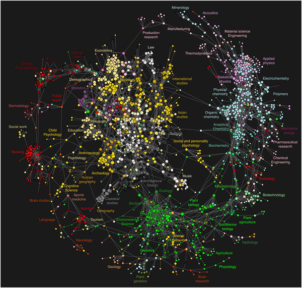
VisualizationClickstream Data Yields High-Resolution Maps of Science is an article that presents an interesting view of the interdisciplinary relationships between the humanities and social sciences, on the one hand, and the sciences on the other. The article used “clickstream” data or usage data collected at various scholarly portals that show not citation links but connections in the activities of the users.

The resulting model was visualized as a journal network that outlines the relationships between various scientific domains and clarifies the connection of the social sciences and humanities to the natural sciences.

They describe the visual appearance of the visualization (above) thus,

To provide a visual frame of reference, we summarize the overall visual appearance of the map of science in Fig. 5 in terms of a wheel metaphor. The wheel’s hub consists of a large inner cluster of tightly
connected social sciences and humanities journals (white, yellow and gray). Domain classifications for the journals in this cluster include international studies, Asian studies, religion, music, architecture and design, classical studies, archeology, psychology, anthropology, education, philosophy, statistics, sociology, economics, and finance. The wheel’s outer rim results from a myriad of connections in M’ between journals in the natural sciences (red, green, blue). In clockwise order, starting at 1PM, the rim contains physics, chemistry, biology, brain research, health care and clinical trials journals. Finally, the wheel’s spokes are given by connections in M’ that point from journals in the central hub to the outer rim.

This article came out of work funded by Mellon at the MESUR project.

MK12: Quantum of Solace Interface

Screen Shot

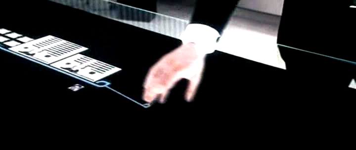
I just blogged about the interface ideas in Stranger than Fiction from MK12. Turns out they were behind the interface for MI5 in the latest James Bond – see UI’s from Movies – Quantum of Solace and see the response from MK12. For images from the movie see NUI Group: Quantom of Solace images.

search-cube – the Visual Search Engine

Screen Shot of Cube

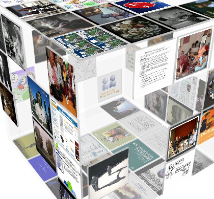
Stan pointed me to search-cube – the Visual Search Engine which generates a 3D cube of images from your search results. It’s a mashup of Google image search. I’m not sure if it is more effective than just looking at the results from a Google Image search, but I like the way panels are missing so you can see through the cube to stuff on the other side.

Beatrice Warde: The Crystal Goblet

Reading the book on Canadian book design, The Surface of Meaning I came across a reference to Beatrice Warde’s The Crystal Goblet. This was given as a lecture in London in 1930 with the title “Printing Should be Invisible” and was printed in the 1950s. It is a clear and apparently influential statement of the modernist view of how a book design should be transparent letting the ideas shine through. It starts with a metaphor of the book as a goblet.

Imagine that you have before you a flagon of wine. You may choose your own favourite vintage for this imaginary demonstration, so that it be a deep shimmering crimson in colour. You have two goblets before you. One is of solid gold, wrought in the most exquisite patterns. The other is of crystal-clear glass, thin as a bubble, and as transparent. …

Bear with me in this long-winded and fragrant metaphor; for you will find that almost all the virtues of the perfect wine-glass have a parallel in typography. …

Now the man who first chose glass instead of clay or metal to hold his wine was a ‘modernist’ in the sense in which I am going to use that term. That is, the first thing he asked of his particular object was not ‘How should it look?’ but ‘What must it do?’ and to that extent all good typography is modernist. …

It is sheer magic that I should be able to hold a one-sided conversation by means of black marks on paper with an unknown person half-way across the world. Talking, broadcasting, writing, and printing are all quite literally forms of thought transference, and it is the ability and eagerness to transfer and receive the contents of the mind that is almost alone responsible for human civilization. …

the most important thing about printing is that it conveys thought, ideas, images, from one mind to other minds. This statement is what you might call the front door of the science of typography. …

Type well used is invisible as type, just as the perfect talking voice is the unnoticed vehicle for the transmission of words, ideas. ..

it is mischievous to call any printed piece a work of art, especially fine art: because that would imply that its first purpose was to exist as an expression of beauty for its own sake and for the delectation of the senses. Calligraphy can almost be considered a fine art nowadays, because its primary economic and educational purpose has been taken away; but printing in English will not qualify as an art until the present English language no longer conveys ideas to future generations, and until printing itself hands its usefulness to some yet unimagined successor. …

The book typographer has the job of erecting a window between the reader inside the room and that landscape which is the author’s words. He may put up a stained-glass window of marvellous beauty, but a failure as a window; that is, he may use some rich superb type like text gothic that is something to be looked at, not through. Or he may work in what I call transparent or invisible typography. …

Printing demands a humility of mind, for the lack of which many of the fine arts are even now floundering in self-conscious and maudlin experiments. There is nothing simple or dull in achieving the transparent page. Vulgar ostentation is twice as easy as discipline.

Perhaps the time comes when printing reluctantly hands off its usefulness to a digital successor like the Kindle which would explain the (re)discovery of pressing form into paper and other arts of the book. I am not making a prediction and especially not recommending this, just reflecting on how the book need not be so transparent as it was supposed to be. When the burden of usefulness is eased off the shoulders of books they can become post-modern chalices, opaque and shiny.

For another take see Book Design in Canada at Cardigan Industries.

Now for the wine within.
Ruecker’s One Minute Movies

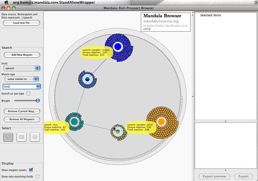
Screen of Mandala Browser
My colleague Stan Ruecker has been create short online movies of humanities computing software tools he is involved in like the Mandala Browser and the Digital Profiles rich prospect browser. These are in the tradition of videos like A Vision of Students Today from the Digital Ethnography folk. There is also the TEI Encoding of Dylan’s Subterranean Homesick Blues. Neat idea – we should get more comfortable with YouTube as a way of conveying ideas.

Taco Lab Blog: Siftables and American Shanzhai?

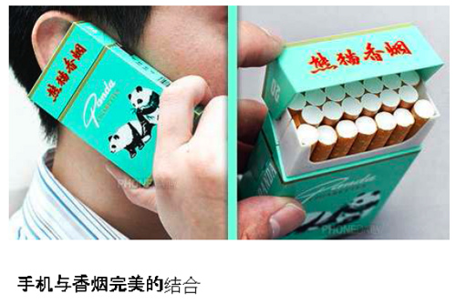
Two images of cellphone cigarette package

The Taco Lab who are probably best known for the Siftables (small cookie-sized tile computes that sense each other) shown at TED have a blog with some interesting posts like this one on American Shanzhai?. Shanzai literally means “mountain fortress” or the hideout of bandits and it refers to pirate activities like hacking cheap copies of consumer goods (that are heavily marked up.) It is now beginning to refer to a creative subculture of improving or altering electronics outside state (and IP) control. Thus the image above is from the Taco Lab blog and is a example of this creative shanzai – in this case a cell-phone/cigarette pack whose value is in its uniqueness. This got me thinking of all the open projects out there that make it easier to hack things like:

  • TuxPhone – a project to develop open hardware and software for a cell phone.
  • Arduino – an open electronics prototyping platform that’s great for interactive art projects
  • LilyPad Arduino – an open device that is light enough for wearables and e-textile projects
  • William Turkel’s Fabrication Lab – a unique (to my knowledge) humanities lab