import random

Stephen Ramsay sent me one of my first Python programs that I wrote in response to his telling me about Perl poems. No doubt I was also influenced by Jerry McGann and his ideas on deformation.

#!/usr/bin/python

import random

def Random_Means(Words):
    return random.randrange(len(Words))

How_Much = ["How much", "All", "Some", "Every", "The", "No"]
Of_What = ["interpretation", "rhetoric", "fiction", "fabrication",
	 "deformation","representation"]
Could_Be = ["could be", "was", "is", "will be", "would be"]
At_End = [".", "!", "?"]

All = Of_What[Random_Means(Of_What)]
Interpretation = Could_Be[Random_Means(Could_Be)]
Is = How_Much[Random_Means(How_Much)]
Just = Of_What[Random_Means(Of_What)]
Deformation = At_End[Random_Means(At_End)]

print Is + " " + All + " " + Interpretation + " " + Just + Deformation #?

This playful exercise then led to Untitled #4 which led to our dialogue with the same name which led to the Animation!

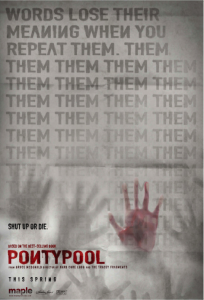
PONTYPOOL | Shut up or die

Picture 14

Last night I watched a Canadian gem of a zombie movie, PONTYPOOL | Shut up or die. The movie takes place almost entirely in a radio studio in the basement of an old church in the small town of Pontypool Ontario. Grant Mazzy, a talk-radio host at the end of his career, exiled from the big city, stays on the air dealing with the eruption of a language plague where English words (primarily endearments like “honey”) carry the new type of virus that infects people. With his producer and technician they try to figure out what is real or not as strange reports come in and they are interviewed by “our affiliate” the BBC. Eventually the zombies, who follow the sound of speaking, repeating words or phrases, break in to try to eat their way to the voice. Grant and his producer figure out that talking in their poor French (remember the importance of bilingualism in Canada) is one way to avoid infection and they work out a cure which involves disrupting mean by asserting things like “kill is kiss”. Back on the radio to talk through the cure, the movie ends with a count down from 10 in French from off camera. Are the French Canadian troops sent in to eradicate the plague about to blow up the radio station just when they have figured out the cure? Was the talk show of the radio station the source of the plague in the first place or was it the posters for a lost cat “Honey” plastered all over town? Could the interview Grant gives to a BBC news announcer have spread the logorrhea abroad? Can words spread ideas (or memes) like a plague closing down our understanding until we are babbling zombies. After all, in the beginning was the word, not its understanding.

Talking of how zombie movies are often a metaphor for things we fear infection from like communism, the author of the screenplay and original book, Tony Burges, says about the movie that,

(a zombie is) really a metaphor for metaphors that keep hunting you long after they have been meaningful. They keep coming at you. … They’re figures of speech that become predatory long after their sort of meaning as figures of speech have sort of left the stage. And so … that for me is the interesting last hundred yards of a zombie’s life. (From an interview with Tony Burgess in December of 2008 at the Drake Hotel in Toronto. Interview by Ian Daffern, co-produced and edited by Tate Young of Vepo Studios.

Looking into a Google Book

When I was in the USA Google Books not long ago, I downloaded a PDF of the public domain work The apology of Socrates (translated by D. F. Nevill). (Note that you can’t get the PDF in Canada, probably because of different copyright laws concerning public domain.) I was double checking that Google didn’t give you easy access to the whole plain text. You either get the PDF (without text) or you can see the Plain Text one page at a time. This makes it hard to run analytical tools for research on public domain texts from Google Books.

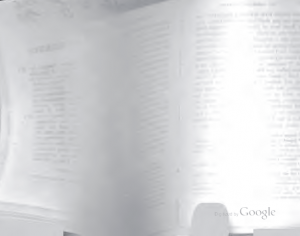
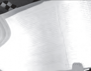
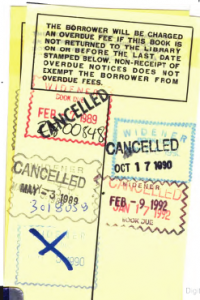
What intrigued me, however, were the traces of the scanning in this PDF. For whatever reason there are a number of images of pages partly turned. These images are the trace of a process.

Picture 9

Picture 8

Picture 7

Picture 5

Picture 2

The last one is from the back where the librarians stamp the book when returned. What do we know about the Google scanning technology? CNet has an interesting story, Patent reveals Google’s book-scanning advantage, about how they use infrared to compensate for the curvature of pages. There are also stories like this one in Tech Crunch on how Google Books Adds Hand Scans that suggest humans are part of the process.

H. P. Luhn, KWIC and the Concordance

We all know that the Google display comes indirectly from the Concordance, but I have found in Luhn’s 1966 “Keyword-in-Context Index for Technical Literature (Kwic Index)” the explicit recognition of the link and the reason for drawing on the concordance.

the significance of such single keywords could, in most instances, be determined only by referring to the statement from which the keyword had been chosen. This somewhat tedious procedure may be alleviated to a significant degree by listing selected keywords together with surrounding words that act as modifiers pointing up the more specific sense in which a keyword has been applied. This method of indexing words is well established in the process of compiling concordances of important works of literature of the past. The added degree of information conveyed by such keyword-in-context indexes, or “KWIC Indexes” for short, can readily be provided by automatic processing. (p. 161)

The problem for Luhn is that simply retrieving words doesn’t give you a sense of their use. His solution, first shown in the late 1950s, was to provide some context (hence “keyword-in-context”) so that readers can disambiguate themselves and make decisions about which index items to follow. It is from the KWIC that we ultimately get the concordance features of the Google display, though it should be noted that Luhn was proposing KWIC as a way of printing automatically generated literature indexes where the kewwords were in the titles. In this quote Luhn explicitly acknowledges that this is a method well established in concordances.

There is also a link between Luhn and Father Busa. According to Black, quoted in Marguerite Fischer, “The Kwic Index Concept: A Retrospective View”,

the Pontifical Faculty of Philosophy in Milan decided that they would make an analytical index and concordance to the Summa Theologica of St. Thomas Aquinas, and approached IBM about the possibility of having the operations performed on Data Processing. Experience gained in this project contributed towards the development of the KWIC Index. (This is a quote on page 123 from Black, J. D., 1962, “The Keyword: Its Use in Abstracting, Indexing, and Retrieving Information”.)

From the concordance to KWIC through to Google?

For some historical notes on Luhn see, H. P. Luhn and Automatic Indexing.

Beatrice Warde: The Crystal Goblet

Reading the book on Canadian book design, The Surface of Meaning I came across a reference to Beatrice Warde’s The Crystal Goblet. This was given as a lecture in London in 1930 with the title “Printing Should be Invisible” and was printed in the 1950s. It is a clear and apparently influential statement of the modernist view of how a book design should be transparent letting the ideas shine through. It starts with a metaphor of the book as a goblet.

Imagine that you have before you a flagon of wine. You may choose your own favourite vintage for this imaginary demonstration, so that it be a deep shimmering crimson in colour. You have two goblets before you. One is of solid gold, wrought in the most exquisite patterns. The other is of crystal-clear glass, thin as a bubble, and as transparent. …

Bear with me in this long-winded and fragrant metaphor; for you will find that almost all the virtues of the perfect wine-glass have a parallel in typography. …

Now the man who first chose glass instead of clay or metal to hold his wine was a ‘modernist’ in the sense in which I am going to use that term. That is, the first thing he asked of his particular object was not ‘How should it look?’ but ‘What must it do?’ and to that extent all good typography is modernist. …

It is sheer magic that I should be able to hold a one-sided conversation by means of black marks on paper with an unknown person half-way across the world. Talking, broadcasting, writing, and printing are all quite literally forms of thought transference, and it is the ability and eagerness to transfer and receive the contents of the mind that is almost alone responsible for human civilization. …

the most important thing about printing is that it conveys thought, ideas, images, from one mind to other minds. This statement is what you might call the front door of the science of typography. …

Type well used is invisible as type, just as the perfect talking voice is the unnoticed vehicle for the transmission of words, ideas. ..

it is mischievous to call any printed piece a work of art, especially fine art: because that would imply that its first purpose was to exist as an expression of beauty for its own sake and for the delectation of the senses. Calligraphy can almost be considered a fine art nowadays, because its primary economic and educational purpose has been taken away; but printing in English will not qualify as an art until the present English language no longer conveys ideas to future generations, and until printing itself hands its usefulness to some yet unimagined successor. …

The book typographer has the job of erecting a window between the reader inside the room and that landscape which is the author’s words. He may put up a stained-glass window of marvellous beauty, but a failure as a window; that is, he may use some rich superb type like text gothic that is something to be looked at, not through. Or he may work in what I call transparent or invisible typography. …

Printing demands a humility of mind, for the lack of which many of the fine arts are even now floundering in self-conscious and maudlin experiments. There is nothing simple or dull in achieving the transparent page. Vulgar ostentation is twice as easy as discipline.

Perhaps the time comes when printing reluctantly hands off its usefulness to a digital successor like the Kindle which would explain the (re)discovery of pressing form into paper and other arts of the book. I am not making a prediction and especially not recommending this, just reflecting on how the book need not be so transparent as it was supposed to be. When the burden of usefulness is eased off the shoulders of books they can become post-modern chalices, opaque and shiny.

For another take see Book Design in Canada at Cardigan Industries.

Now for the wine within.

The Apostrophe: When they’re gone, theyre gone

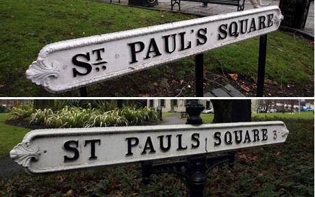
Image of Street Sign without Apostrophe

Today’s Edmonton Journal reprinted a great article on the apostrophe following the widely reported decision of the Birmingham city council to stop using apostrophes in signs to save money (and not have do deal with pedants). The article, titled When theyre gone, well all be struggling with English traces some of the issues around the use of this “tadpole-shaped bundle of trouble.” It is worth pointing out that apostrophes are important to humanities computing. They are used, among other things, to mark absence. As the etymology of apostrophe suggests, they point away from the text, like a link, to something missing or passed over (in the sense that you don’t pronounce the missing sylable.) I’m less interested in the controversy over punctuation reform as what we can learn from punctuation about markup and the digital representation of text.

  • Punctuation is both part of the text and about the text. An apostrophe likewise is both part of the string of characters that we could call the text and yet points to something missing that the reader can fill in. This being of it and about it is what is difficult about the textual ontology of markup. See Markup: Buzzetti and Renear.
  • There is, as with most punctuation, a rhetorical dimension to the apostrophe. The word also refers to an exclamatory figure of speech when a speaker turns away and addresses some other imaginary audience often introduced by “O”. For example when Juliet turns away and addresses Romeo in Romeo and Juliet, Act II, Scene 2, “O Romeo, Romeo! wherefore art thou Romeo?” Likewise markup is apostrophic in that it typically addresses the machine rather than the reader. The tags of the anchor element in HTML, for example, are hidden from the reader and provide instruction for the machine should the reader click on the anchored text.
  • The single quotation mark on typewriters and early computers (7-bit ASCII) is one of the most overloaded characters. It is used for all sorts of different things from the single quotation mark, to the apostrophe, to the acute accent. Likewise markup overloads certain characters with special meaning through the general strategy of the escape character. The left angle bracket < gets loaded with a new function in XML markup languages: it serves not as a visible character, but as the mark that sets certain text aside to be interpreted differently as code. The text between angle brackets is turned aside to be interpreted by the machine. That we have escape characters or punctuation like an apostrophe that can turn the interpretation is somehow a important to computing and digital representation. That most keyboards have an Escape key indicates how important is the possibility of escape. It is the key to the possibility of interruption of the machine.

The apostrophe could be the punctuation mark of an escape that always was. It turns us away from using text to appreciate what is gone. They’re gone because they are always escaped. Theyre gone because they were never here.

The Journal of Urban Typography

Image
The Journal of Urban Typography is a project like the Dictionary of Words in the Wild that “is dedicated to the documentation and study of signs, word fragments, and typography created with utilitarian intent in urban environments.” Many of the images are beautiful – the author of the site calls it a journal but it is more of an art book. The interface is intriguing as if it were a bunch of polaroids. You can dismiss some and rearrange them. This is built on Tumblr, an online blogging or service that you can adapt to collecting different types of things. Thanks to Peter O for this.

EMiC: Editing Modernism in Canada

EMiC] Editing Modernism in Canada is a neat project that was funded by SSHRC as a Strategic Cluster. Dean Irvine at Dalhousie leads it and the idea is to produce “critically edited texts by modernist Canadian authors”, especially those out of print. It has a nice link to learning in that one reason for editing modernist Canadian texts is to make them available for teaching and learning. Deeper than that, however, is what seems to be an apprentice model of involving (graduate) students in editing. The network of partnerships is impressive too.

Pliny: Welcome

Screen Shot of Pliny Pliny, the annotation and note management tool by John Bradley at King’s College London just got a Mellon Award for Technology Collaboration.

The Mellon Awards honour not-for-profit organisations for leadership in the collaborative development of open source software tools with application to scholarship in the arts and humanities, as well as cultural-heritage not-for-profit activities.

Pliny is free and you can try it out on the Mac or PC. John has thought a lot about how tools fit in the research process of humanists.