Ruecker on Visualizing Time

Stan Ruecker gave a great talk today about Visualations in Time for the Humanities Computing Research Colloquium. He is leading a SSHRC funded project that builds on Drucker and Noviskie’s work on Temporal Modelling. (I should mention that I am on the project.) Stan started by talking about all the challenges to the linear visualization of time that you see in tools like Simile. They include:

  • Uncertainty: in some cases we don’t know when it took place.
  • Relative time: how do we visualize all the ways we talk about time as relative (ie. events being before or after another)?
  • Phenomenological time: how do we represent the experience of time.
  • Reception: there is not only the time something happens but the time it is read or received.

Stan then showed a number of visual designs for these different ways of thinking about time. Some looked like rubber sheets, some like frameworks of cubes with things in them, and some like water droplets. Many of these avoided the “line” in the visualization of time.

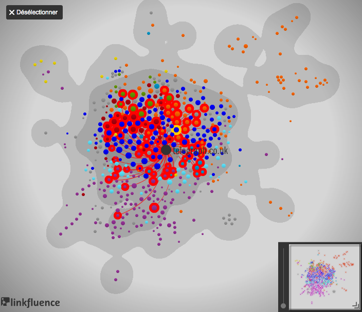
Guardian visualization: Anders Breivik’s spider web of hate

The Guardian has an interesting visualization of Anders Breivik’s manifesto mapped by linkfluence. Andrew Brown explains what they learned from the visualization in an article Anders Breivik’s spider web of hate (Sept. 7, 2011). The visualization shows the network of links from Breivik’s manifesto to other types of sites. There are a large number of links to mainstream media and to the Wikipedia, but also a number to other right wing sites. As Brown puts it,

The Guardian has analysed the webpages he links to, and the pages that these in turn link to, in order to expose a spider web of hatred based around three “counter-jihad” sites, two run by American rightwingers, and one by an eccentric Norwegian. All of these draw some of their inspiration from the Egyptian Jewish exile Gisele Littman, who writes under the name of Bat Ye’or, and who believes that the European elites have conspired against their people to hand the continent over to Muslims.

The Garden of Error and Decay

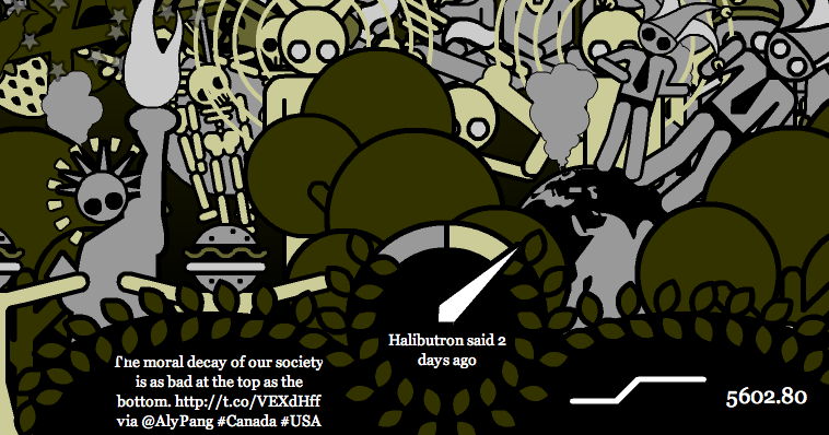
The Garden of Error and Decay is a real-time visualization of disasters mentioned in Twitter and other feeds. The text about the interactive says “this innovative moving image format is something like a real-time data driven narrative. This project is not a film, not a game, and not a nonlinear interactive story.” The visualization uses pictograms that represent the type of disaster. You can see the original twitter text.

Thanks to Scott for this.

Infomous Clouds

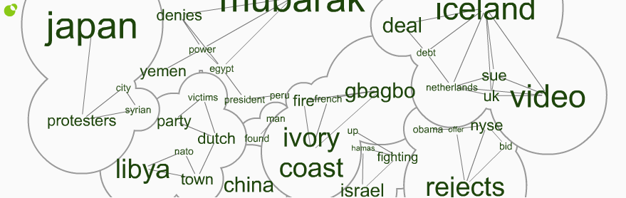
I was on The Atlantic site and noticed a neat visualization badge by Infomous. It is a variant on the usual word cloud that draws lines between related words and puts simple cloud circles around related words. As you can see it doesn’t always get the clouds right. On the left you have Japan connected to protesters and protesters connected to Syria. There is not, however, any connection between Japan and Syria except that protests are happening in both.

If you get an account Infomous lets you make your own clouds.


Update: Pablo Funes from Icosystem Corp sends this email comment on the post:

We use Mark Newman’s algorithm for network communities to identify clusters of news. In your example, Japan and Syria are both connected to “protesters” and therefore share the same cluster even though there are no news articles that bear on both Japan and Syria (so there is no direct connection between both terms). One could argue, with this example at least, that there is a worldwide series of events that have been unfolding over the last few months, with public protests as the visible common feature (Tunisia, Egypt, Libya, and so on) which makes the connection “countries where protests are happening” a relevant one. And yet, it is true that sometimes the connection is not relevant at all, as it happens when generic words, such as “video” or “said” for example, are shared across news stories.

Our Appinions-based clouds rely on sophisticated semantic analysis provided by Appinions.com (see http://www.infomous.com/site/events/JapanNuclear/). Here, topics are connected because they are discussed by the same web user in the same posting. We use the same algorithm to identify clusters in this network. You can turn off clustering by unchecking “groups” on the bottom toolbar.

Modkit – Software

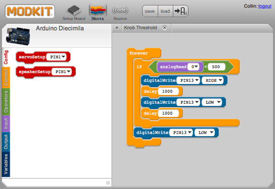
Garry send me a link to a very cool project which has developed a visual programming language for the Arduino called Modkit. Watch the screencast to get the idea.

I’ve seen a number of visual programming environments and this one reminds me of the old programming environment for Lego Mindstorms. What is new is that it runs off the web the way Design By Numbers does.

Whether it actually makes programming the Arduino easier or, as is often the case with visual programming, turns out to be slower and still as complicated, remains to be seen. It has a nice code view so you can switch to writing code if you get irritated with clicking around for stuff.

Could we build a visual programming language like this for text analysis?