 Barry Cornelius has produced an interesting “railroad” visualization of the TEI content models. See TV: the TEI Visualizer. This is from TEI-L the Text Encoding Initiative list.
Thanks to Peter Boot for correcting me on who created this.
Barry Cornelius has produced an interesting “railroad” visualization of the TEI content models. See TV: the TEI Visualizer. This is from TEI-L the Text Encoding Initiative list.
Thanks to Peter Boot for correcting me on who created this.
 Walter Rafelsberger sent me a note about a project similar to the Pathway project I blogged. His project is Rhizome Navigation lets one navigate a space of wiki page titles or blogs in 3d. It uses access logs so it can, I assume, show how users navigate. Very neat – try the demo.
 Pathway is a small custom application (just for Max OS X) that creates a visualization while you browse the Wikipedia. It is not a general pupose browser, it is just for the Wikipedia, but it includes some nice features for reflecting on the “path” you take through the wiki. I should note that paths are a feature Vannevar Bush talked about in “As We May Think” (Atlantic Monthly, July 1945.)
This comes from Matt.
 When I was showing students the Nielsen F-Pattern Alertbox one of them pointed me to Crazy Egg ‚Äì visualize your visitors – a neat service that watches user’s clicks on your pages and then shows you the results in overlays like the heatmap example here.

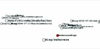
ClustrMaps offers a mapping service for hits on your blog or site. It shows a small map with bubbles where your visitors are coming from. This service is apparently free for sites with fewer than 2,500 visitors a day, but they are not allowing any new registrations. Why do I want one more when I can’t get a free map?
 (Sparkline of US deficit over time) Sparklines: theory and practice is a thread in Edward Tufte’s Ask E.T. forum (which is a great place to follow discussions on design issues.) The thread starts with images of some pages from Tufte’s new book, Beautiful Evidence (2006) on sparklines which are defined as “intense, simple, word-sized graphics”. The sparkline at the beginning of this entry is from the Sparkline PHP Graphing Library. Another source of sparkline tools is Bissantz sparkline tools. Thanks to Shawn for this link.
So how can sparklines be woven into text anlysis environments? Small distribution graphs could be included with lists of word or KWIC displays in tools like the TAPoRware tools.
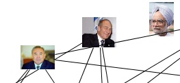 PertinenceMining.com is a French company that has a number of neat text processing products built on their KENiA or “Knowledge Extraction and Notification Architecture.” One their products is Connivences.info which produces maps of “actors” in the news with weighted lines to indicate relationships.
Another interesting tool is their Google + Pertinence Summarizer that enhances the results from Google with a “Summarize” button which splits the linked page into sentences and tries to rank their pertinence to the document so you can choose to see only the most pertinent. The interface took me a while – I’m not sure it works.
 mandalabrot.net is the home of kiddphunk (Ian Timourian) and his visualizations, experiments and remixes. He has a number of Context Free Design Grammar experiments. Timourian also has a photo kiddphunk site with an doubled way of showing images.
Thanks to Johnny R. for pointing me to this collection of “Explorations of Generative Art, Mathematics, Algorithmic Design and the Beauty of Life / Vol 1”.
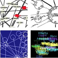
VisualComplexity.com intends to be a unified resource space for anyone interested in the visualization of complex networks. The project’s main goal is to leverage a critical understanding of different visualization methods, across a series of disciplines, as diverse as Biology, Social Networks or the World Wide Web. I truly hope this space can inspire, motivate and enlighten any person doing research on this field. (From the About page.)
I discovered this through the del.icio.us.discover project. We need a comparable collection of text visualization projects.
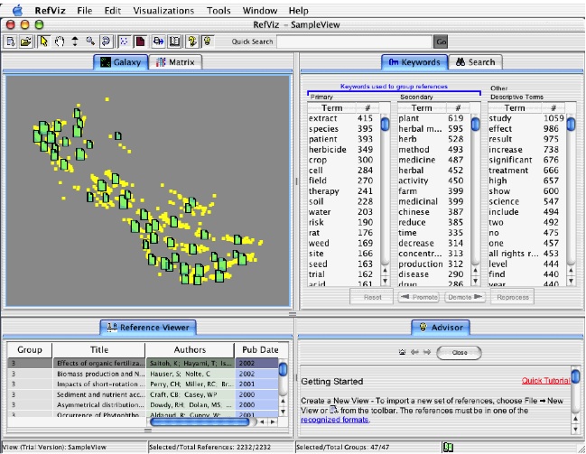 RefViz is a visualization tool from Thomson Researchsoft (who also publish EndNote and ProCite). RefViz lets you visualize “galaxies” of bibliographic references showing clusters of references by keywords. It also has a matrix view where you can see how keywords correlate.
Save time and learn more about what is happening in the literature with RefViz. With this powerful text analysis and visualization software program, you get an intuitive framework for exploring reference collections based on content. (From the Product Info page.)