The Old Bailey Datawarehousing Interface

The latest version of our Old Bailey Datawarehousing Interface is up. This was the Digging Into Data project that got TAPoR, Zotero and Old Bailey working together. One of the things we built was an advanced visualization environment for the Old Bailey. This was programmed by John Simpson following ideas from Joerg Sanders. Milena Radzikowska did the interface design work and I wrote emails.

One feature we have added is the broaDHcast widget that allows projects like Criminal Intent to share announcements. This was inspired partly by the issues of keeping distributed projects like TAPoR, Zotero and Old Bailey informed.
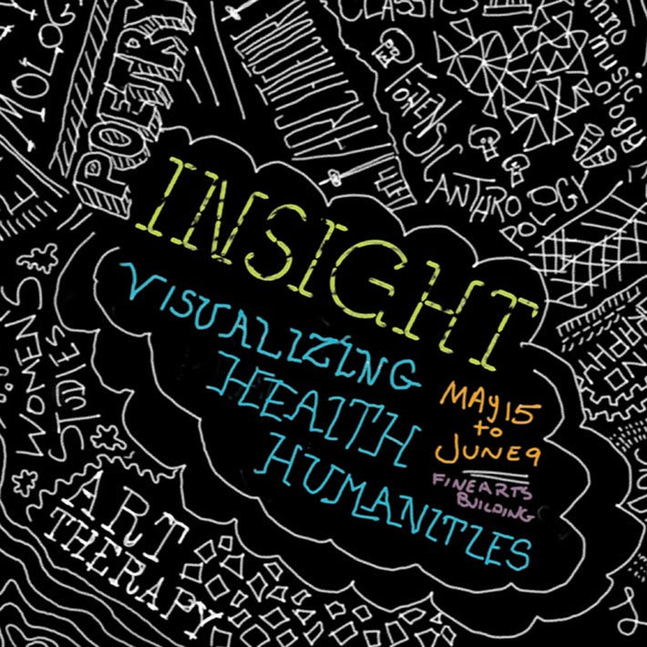
InSight: Visualizing Health Humanities

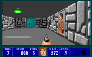
The GRAND group has a work being exhibited at the InSight: Visualizing Health Humanities show that starts tonight. We used Unity to create a FPS (First Person Shooter) type of game for medical communication. The game, called CatHETR, lets players move through a ward dealing with communicative situations. This project was supported by the GRAND Network of Centres of Excellence.

Perlin: Interactive Map of Pride and Prejudice

As I mentioned in my post on the GRAND conference, Ken Perlin showed a number of interesting Java apps that illustrated visual ideas. One was a Interactive Map of Pride and Prejudice. This interactive map is a rich prospect of the whole text which you can move around to see particular parts. You can search for words (or strings) and see where they appear in the text. You can select some text and it searches. The interface is simple and intuitive. You can see how Perlin talks about it in his blog. I also recommend you look at his other experiments.

GRAND 2012 Conference Report

Last week I was at the GRAND 2012 conference. GRAND (Graphics, Animation, and New Media) is a Networks of Centres of Excellence that brings together people across disciplines and across the country around gaming, new media and so on. You can see my GRAND 2012 conference notes here.

This year we had two of the best keynotes of any conference I have been to. Valerie Steeves talked about her research into parents and youth on the internet. The change in attitudes of both parents and youth to the internet between 2000 and today was dramatic. Ken Perlin was the closing keynote and he showed Java apps that he wrote as experiments. It made me want to learn to program in Java just to have as much fun as he was having.

The X Factor – Brainstorm – The Chronicle of Higher Education

From Humanist, a link to an article on online education, The X Factor (in the Brainstorm blog of the Chronicle of Higher Education. The post talks about how Harvard University has joined with MIT to create edX, an online education consortium. Harvard is now joining the MOOC (Massive Online Open Courses) bandwagon pioneered by some Stanford profs who opened their courses to thousands. The author, Kevin Carey, points out that edX won’t compete with MIT or Harvard, but with other online providers and with less prestigious institutions.

I worry we are going to see a lessening of educational diversity. I worry that the star quality of MIT, Harvard and Stanford will drive out less prestigious players leaving us with a small number of online courses. Fewer instructors for more people will mean more standardization of education and less diversity.

The New York Times has a Room for Debate on this, Got a Computer? Get a Degree with different reactions to the news. Most seem positive, but few feel that certificates for taking MOOCs are comparable to real course credit.

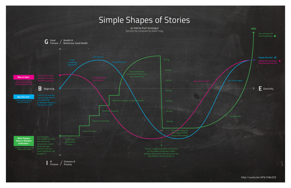
Kurt Vonnegut on the Shapes of Stories

I’ve been meaning to blog on the video circulating of Kurt Vonnegut talking about the Shape of Stories. He describes the curves followed by popular stories like “boy meets girl” and suggests computers could even understand such simple curves. In Lapham’s Quarterly you can read the text of this lecture with illustrations. See Kurt Vonnegut at the Blackboard. In this version he asks about the value of such systems, a question which could apply equally to computer generated visualization,

The question is, does this system I’ve devised help us in the evaluation of literature? Perhaps a real masterpiece cannot be crucified on a cross of this design. How about Hamlet?

He concludes that the system doesn’t work because the truth is ambiguous. We simply don’t know in complex works (like Hamlet) if news is good or bad. Good literature is open to interpretation.

But there’s a reason we recognize Hamlet as a masterpiece: it’s that Shakespeare told us the truth, and people so rarely tell us the truth in this rise and fall here [indicates blackboard]. The truth is, we know so little about life, we don’t really know what the good news is and what the bad news is.

Many have noticed this amusing play on visualization including an infographic on Visua.ly, Kurt Vonnegut on the Shapes of Stories:

Plot visualization from Vonnegut

Prism: Collaborative Interpretation

Prism is the coolest idea I have come across in a long time. Coming from the University of Virginia Scholar’s Lab, Prism is a collaborative interpretation environment. Someone comes up with categories like “Rhetoric”, “Orientalism” and “Social Darwinism” for a text like Notes on the State of Virginia. Then people (with accounts, which you can get freely) go through and mark passages. This creates overlapping interpretative markup of the sort you used to get with COCOA in TACT, but unlike TACT, many people can do the interpretation – it can be crowdsourced.

They are planning some visualizations of the results including what look like the types of visualizations that TACT gave where you can see words distributed over tagged areas.

Bethany Nowviskie explains the background to the project in this Scholar’s Lab post.