We need to talk about TED by Benjamin Bratton

The Guardian has reprinted the trasnscript of Benjamin Bratton’s We need to talk about TED talk that is critical of TED. He looks at each of the three terms in T.E.D. (Technology, Entertainment, Design) and here is paraphrase of some of his points:

  • TED talks conceptualize the future, but tend to oversimplify it.
  • TED wants to be about imagining the future, but it tends to promote placebo politics and technology.
  • We are told that change is accelerating, but while that may be true of technology, it isn’t true of politics and culture.
  • TED talks have too much faith in technology. Another futurism is possible.
  • Capitalism is presented as being about rocket ships and nanomedicine. It is actually about Walmart jobs, McMansions and government spying.

He ends by talking about design. He argues that it shouldn’t be about innovation, but about innoculation. Design is presented in TED as the heroic solving a puzzles that will magically fix everything. Instead he argues for design as slogging through the hard stuff – understanding the politics and cultural issues.

He ends by summarizing why he feels TED is not just a distraction, but harmful. He believes TED misdirects our attention by charming us with the entertaining simple solutions while avoiding the messy, chaotic, complex issues that can’t be solved by technology.

I sometimes wonder if Humanities Computing didn’t serve a similar purpose in the humanities. Is it a form of comic (technological) relief from the brutal truths we confront in the humanities … especially the suspicion that we make no difference when we do confront racism, sexism, surveillance, politics and technohype. Why not relax and play a bit with the other?

Pentametron: With algorithms subtle and discrete

Scott send me a link to the Pentametron: With algorithms subtle and discrete / I seek iambic writings to retweet. This site creates iambic pentameter poems from tweets by looking at the rythm of words. It then tries to find ryhming last words to create a AABB rhyming scheme. You can see an article about it on Gawker titled, Weird Internets: The Amazing Found-on-Twitter Sonnets of Pentametron.

The Never-Before-Told Story of the World’s First Computer Art

The Atlantic has a story about The Never-Before-Told Story of the World’s First Computer Art (It’s a Sexy Dame). The image (see above) was apparently created by an IBM programmer for the SAGE system and was used as a diagnostic.

According to Tipton, the program that displayed the pin-up image was a diagnostic that tested data flow between the two SAGE computers on site (referred to as the A and B computers). At the end of every shift, as one computer was about to go offline and switch over to the other, the active machine would begin transferring flight and intercept data to the standby machine so there could be a seamless switch over.

Two switching consoles on site were used to handle this process. After running the diagnostic, Tipton describes, if the pin-up displayed correctly on the screen, then data was being transferred between the A and B computers correctly. If the image displayed improperly, then the technicians immediately knew there was a problem.

This reminds me of the story of Lena and the use of her image. Why were so many early images drawn from porn? Does this say something about the male culture of computing in those years that it was cool/acceptable to use pin up pictures when you needed a graphic image?

Thanks to @manovich for this.

InSight: Visualizing Health Humanities

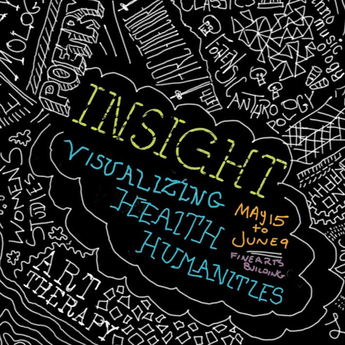
The GRAND group has a work being exhibited at the InSight: Visualizing Health Humanities show that starts tonight. We used Unity to create a FPS (First Person Shooter) type of game for medical communication. The game, called CatHETR, lets players move through a ward dealing with communicative situations. This project was supported by the GRAND Network of Centres of Excellence.

Google Art Project

An article in the New York Times led me to the Google Art Project. This project doesn’t feel like a Google project, perhaps because it uses an off-black background and the interface is complex. The project brings together art work and virtual tours of many of the worlds important museums (but not all.0 You can browse by collection, artist (by first name), artworks, and user galleries. You can change the language of the interface (and it seems to change even when you don’t want it to in certain circumstances.) When viewing a gallery you can get a wall of paintings or a street view virtual tour of the gallery. Above you see the “Museum View” of a room in the Uffizi with a barrier around a Filippino Lippi that is being treated for a woodworm infestation! In the Museum View you can pan around and move up to paintings much as you would in Google Maps in Street View. On the left is a floor plan that you can also use.
This site reminds me of what was one of the best multimedia CD-ROMs ever, the Musee d’Orsay: Virtual Visit. This used QuickTime VR to provide a virtual tour. It had the sliding walls of art. It also had special guides and some nice comparison tools that let you get a sense of the size of a work of art. The Google Art Project feels loosely copied from this right down to the colour scheme. It will be interesting to see if the Google Art Project subsumes individual museum sites or consortia like the Art Museum Image Consortium (Amico.)

I find it interesting how Google is developing specialized interfaces for more and more domains. The other day I was Googling for movies in Edmonton and found myself on a movies – Google Search page that arranges information conveniently. The standard search interface is adapting.

How Star Trek artists imagined the iPad… 23 years ago

How Star Trek artists imagined the iPad… 23 years ago is an article in Ars Technica about the design of the iconic Star Trek interfaces from those of PADDs (Personal Access Display Devices) to the touch screens used on the bridge. It turns out that one of the reasons for the flat touch screen interfaces was that they were cheap (compared to panels with lots of switches as contemporary spacecraft had.)

What could be simpler to make than a flat surface with no knobs, buttons, switches, or other details? Okuda designed a user interface dominated large type and sweeping, curved rectangles. The style was first employed in Star Trek IV: The Voyage Home for the Enterprise-A, and came to be referred to as “okudagrams.” The graphics could be created on transparent colored sheets very cheaply, though as ST:TNG progressed, control panels increasingly used video panels or added post-production animations.

Motion Capture and Noh

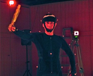
On November 10th I was invited by Dr. Kozaburo Hachimura to watch as his graduate students capture the motion of a master Noh performer. The motion capture was run in a special lab that was specifically built for this. They have a floor that was built to Noh theatre standards and we had to take our slippers off to protect the wood. There is a rig on the ceiling with the motion capture cameras and a sound booth in the back. When not in use for motion capture the room is used for seminars and meetings.

Continue reading Motion Capture and Noh

TRAFFIC: Conceptual Art in Canada 1965-1980

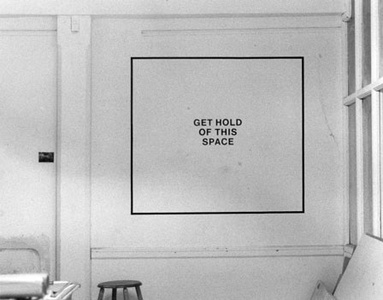
Gordon Lebredt Get Hold Of This Space 1974

Go see the TRAFFIC: Conceptual Art in Canada 1965-1980 exhibit at the Art Gallery of Alberta. It is a dense exhibit with hundreds of works and relevant documentation. It is organized by cities (a room for Halifax, one for Montreal …) and seems carefully researched. You will find yourself bewildered and amused at the variety of conceptual art projects executed in Canada. You will notice that everything was done back then with typewriters, video and tape recorders. The colors look bleached the way old and cheap photographs are. The aging of all those postcards and paper forms dates the works as if they were brought out of the attic or from the back of the family station wagon left in the sun.

This show was developed by a number of museums (from Vancouver to Halifax) and is touring those museums. You can read about the show when it was in Toronto. Or you can read about it in Magenta.

NFB: Out My Window

Joyce pointed me to a National Film Board (NFB) interactive work, Out My Window: Interactive Views from the Global Highrise. The work, directed by Katerina Cizek documents the lives of people in apartments through their apartments. For each apartment there is a 360 degree view that you can pan around (sort of like QuickTime VR.) Certain things can be clicked on to hear and see short documentaries with the voice of the dweller. These delicate stories are very effective at giving us a view of apartment life around the world.

MA in Experimental Digital Media at Waterloo

Thanks to David I found out about the University of Waterloo’s new MA in Experimental Digital Media. The MA looks like something you could do in 12 months, but it isn’t clear. The MA doesn’t have a thesis – instead it has project which can be a prototype with commentary:

The Project is the culminating point of the program, in which students demonstrate a mastery of critical theories and theoretical concepts by embodying them in digital artifacts, environments, or practice.   Projects will entail the design, conception or production of objects-to-think-with, evocative objects that focus attention on key cultural and theoretical issues in the humanities.

In many cases the project will remain at a design or prototype stage, although the manufacture of the object is by no means ruled out in principle.  The design or prototype itself will be accompanied by a commentary of 40 pages in which the student will describe the theoretical and cultural context of the project and its aims,  analyse its feasibility and its functioning, describe its cultural and rhetorical significance, and indicate its possible lines of development.