David Sepkoski has published a nice essay in Aeon about What a fossil revolution reveals about the history of ‘big data’. Sepkoski talks about his father (Jack Sepkoski), a paleontologist, who developed the first database to provide a comprehensive record of fossils. This data was used to interpret the fossil record differently. The essay argues that it changed how we “see” data and showed that there had been mass extinctions before (and that we might be in one now).
The analysis that he and his colleagues performed revealed new understandings of phenomena such as diversification and extinction, and changed the way that palaeontologists work.
Sepkoski (father) and colleagues
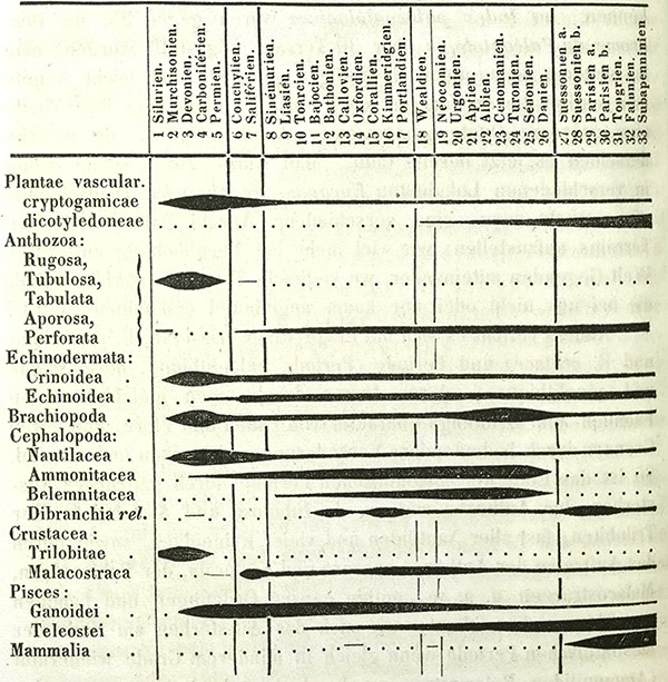
The essay then makes the interesting move of arguing that, in fact, Jack Sepkoski was not the first to do quantitative palaeontology. The son, a historian, argues that Heinrich Georg Bronn in the 19th century was collecting similar data on paper and visualizing it (see spindle diagram above), but his approach didn’t take.
This raises the question of why Sepkoski senior’s data-driven approach changed palaeontology while Bronn’s didn’t. Sepkoski junior’s answer is a combination of changes. First, that palaeontology became more receptive to ideas like Stephen Jay Gould’s “punctuated equillibrium” that challenged Darwin’s gradualist view. Second, that culture has become more open to data-driven approaches and the interpretation visualizations needed to grasp such approaches.
The essay concludes by warning us about the dangers of believing data black boxes and visualizations that you can’t unpack.
Yet in our own time, it’s taken for granted that the best way of understanding large, complex phenomena often involves ‘crunching’ the numbers via computers, and projecting the results as visual summaries.
That’s not a bad thing, but it poses some challenges. In many scientific fields, from genetics to economics to palaeobiology, a kind of implicit trust is placed in the images and the algorithms that produce them. Often viewers have almost no idea how they were constructed.
This leads me to ask about the warning as gesture. This is a gesture we see more and more, especially about the ethics of big data and about artificial intelligence. No thoughtful person, including myself, has not warned people about the dangers of these apparently new technologies. But what good are these warnings?
Johanna Drucker in Graphesis proposes what to my mind is a much healthier approach to the dangers and opportunities of visualization. She does what humanists do, she asks us to think of visualization as interpretation. If you think of it this way than it is no more or less dangerous than any other interpretation. And, we have the tools to think-through visualization. She shows us how to look at the genealogy of different types of visualization. She shows us how all visualizations are interpretations and therefore need to be read. She frees us to be interpretative with our visualizations. If they are made by the visualizer and are not given by the data as by Moses coming down the mountain, then they are an art that we can play with and through. This is what the 3DH project is about.