TAPoRware and the Digital Humanities Quarterly

Screen capture

The latest version of the Digital Humanities Quarterly is out and they have done something neat. They have included some of the TAPoRware tools in the bar at the top of articles like Wendell’s reflections, Something Called Digital Humanities.

    Our online pharmacy is the perfect resource for people to get their drugs without any hassles or awkwardness. cialis We work hard to make sure you save money every time you shop with us. levitrasoma At our online store, you pay less and get more. viagra

This is someone anyone can do. We provide instructions on the code to put in your HTML on the TAPoRware Add Tools Demo page. There are different models. You will also find code on the documentation pages for individual tools on the TADA Documentation Pages.

Now, Analyze That: An Experiment in Text Analysis

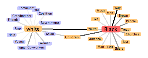
Image from Visual Collocator

Stéfan Sinclair and I have just finished writing up an essay from an extreme text analysis session, Now, Analyze That. It is first of all a short essay comparing Obama and Wright’s recent speeches on race. The essay reports on what we found in a two day experiment using our own tools and it has interactive handles woven in that let you recapitulate our experiment.

The essay was written in order to find a way of write interpretative essays that are based on computer-assisted text analysis and exhibit their evidence appropriately without ending up being all about the tools. We are striving for a rhetoric that doesn’t hide text analysis methods and tools, but is still about interpretation. Having both taught text analysis we have both found that there are few examples of short accessible essays about something other than text analysis that still show how text analysis can help. The analysis either colonizes the interpretation or it is hidden and hard for students and others to recapitulate. Our experiments are therefore attempts to write such essays and document the process from conception (coming up with what we want to analyze) to online publication.

Doing the analysis in a pair where one of did the analysis and one documented and directed was a discovery for me. You really do learn more when you work in a pair and force yourself to take roles. I’m intrigued at how agile programming practices can be applied to humanities research.

This essay comes out of our second experiment. The first wasn’t finished because we didn’t devote enough time together to it (we really need about two days and that doesn’t include writing up the essay.) There will be more experiments as the practice of working together has proven a very useful way to test the TAPoR Portal and think through how tools can support research all the way through the life of a project, from conceptualization to publication. I suspect as we try different experiments we will be changing the portal and the tools. too often tools are designed for the exploratory stage of research instead of the whole cycle right to where you write an essay.

You can, of course, actually use the same tools we used on the essay itself. At the bottom of the left-hand column there is an Analysis Tool bar that gives you tools that will run on the page itself.

RSS Feed Screen Saver

Screen Shot

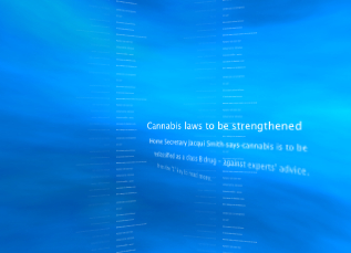
I just noticed that Mac OS X has a RSS feed screensaver that shows headlines in spiraling columns. When you see an item you want to read you press a key and it opens the item. It is an interesting example of live text visualization. You can see it on YouTube – RSS Feed on my Screen saver.

Quartz Composer Screen Shot

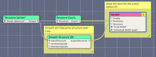
The RSS Screensaver seems to be built in a visual programming language for the Mac called Quartz Composer. From the documentation and discussions online it sounds like something one can play with easily (when I have the time.)

What would an academic screen saver look like?

T-REX: TADA Research Evaluation Exchange

T-REX logo

Stéfan Sinclair of TADA has put together an exciting evaluation exchange competition, T-REX | TADA Research Evaluation Exchange. This came out of discussions with Steve Downie about MIREX (Music Information Retrieval Evaluation eXchange) and our discussions with the SHARCNET folk and then DHQ. The initial idea is to have a competition for ideas for tools for TAPoR, but then to migrate to a community evaluation exchange where we agree on challenges and then compare and evaluate different solutions. We hope this will be a way to move tool development forward and get recognition for it.

Thanks to Open Sky Solutions for supporting it.

Personalized Online Electronic Text Services (POETS)

I just came across a group at the Kyoto Notre Dame University who are building small text utilities called, Personalized Online Electronic Text Services (POETS). They have a nice English Vocabulary Assistant (EVA) WordNet 3.0 Vocabulary Helper which takes a word, looks it up in WordNet and gives you an exhaustive entry. They also have a Eva Text Analysis service that will, for example, link all words in a text except for stop words, to the Vocabulary Helper entry.

VersionBeta3 < Main < WikiTADA

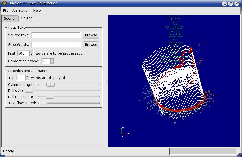
Screen Shot of BigC GUI

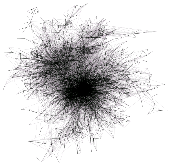
We have a new version of the Big See collocation centroid. Version Beta 3 now has a graphical user interface where you can control settings before running the animation and once the animation is run. As before we show the process of developing the 3D model as an animation. Once run you can manipulate the 3D model. If you turn on stereo you can see the text model as a 3D object if you have the right glasses on (it supports different types including red/green.)

I’m still trying to articulate the goals of the project. Like any humanities computing project the problem and solutions are emerging as we develop and debate. I now think of it as an attempt to develop a visual model of a text that can be scaled out to very high resolution displays, 3D displays, and high performance computing. The visual models we have in the humanities are primitive – the scrolling page and the distribution graph. TextArc introduced a model, the weighted centroid, that is rich and rewards exploration. I’m trying to extend that into three dimensions while weaving in the distribution graph. Think of the Big See is a barrel of distributions.

High Resolution Visualization

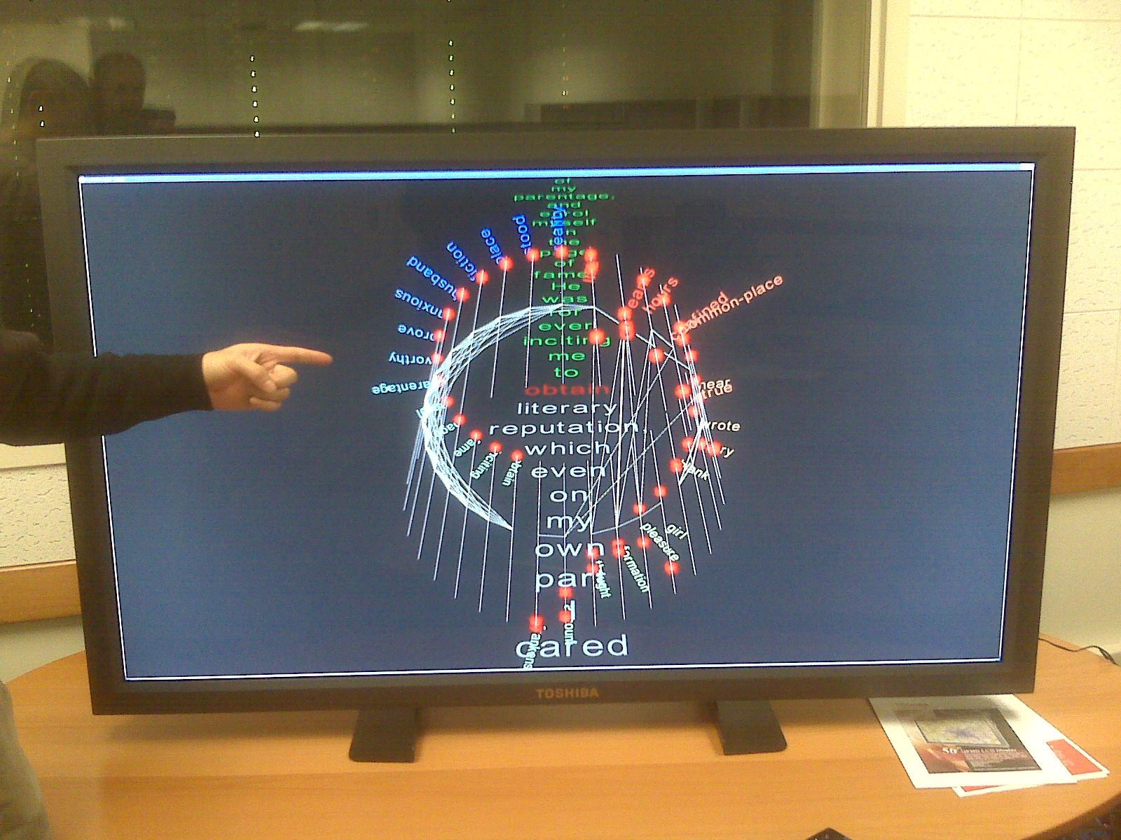
Image of Monitor
In a previous post I wrote about a High Performance Visualization project. We got the chance to try the visualization on a Toshiba high resolution monitor (something like 5000 X 2500). Above you can see a picture I took with my Blackberry.

What can we do with high resolution displays? What would we show and how could we interact with them? I take it for granted that we won’t just blow up existing visualizations.

High Performance Visualization

Screen shot of visualizationI’m working with the folks at our local HPC consortium, SHARCNET on imagining how we could visualize texts with high resolution displays, 3D displays, and cluster computing. The project, temporarily called The Big See has generated an interested beta version. You can see a video on the process running and images from the final visualization here, Version Beta 2.

One of the unanticipated insights from this project is that the process of building the 3D model, which I will call the *animation*, is as interesting as the final visual model. From the very first version you could see the text flowing up and the high frequency words jostling each other for position. Words would start high and then slide clockwise around. Collocations build up as it goes. We don’t have the animation right, but I think we are on to something. You can see Version B2 as an MP4 animation here.

Now we will start playing with the parameters – colours, transparency, and weight of lines.