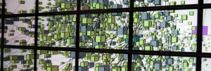
Luciano Frizzera has put the video up that he showed at Digital Humanities 2013 in our INKE panel. His video shows his multi-point touch variorum edition prototypes. He has been prototyping how we could use gestures on large screens, especially tables. He has interesting ideas about how people can discuss something on different sides of a table.
Category: Visualization
Data Analytics’ Next Big Feat: Sarcasm Detection
Slashdot has a story about Data Analytics’ Next Big Feat: Sarcasm Detection. The BBC article that this draws from says the French company Spotter has algorithms for 29 different languages and that they can “identify sentiment up to an 80% accuracy rate.”
A screen shot from Spotter shows a tool running on an iPad with a word cloud for exploration and selection tools.
The same Slashdot story sent me also to a Wall Street Journal story about how the Obama 2012 campaign used Salesforce for sentiment analysis on email coming into the campaign.
Text Visualization
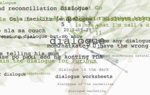
I came across a neat Japanese visualization tool whose name I think means something like “language leaves”, コトバノキ. The visualization uses a tree metaphor and will work with a url so you can pass it English text.
Visualizing Collaboration
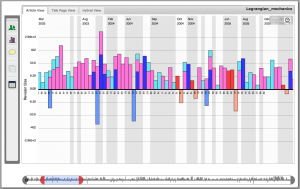
Ofer showed me a interactive visualization of the collaboration around a Wikipedia article. The visualization shows the edits (deletions/insertions) over time in different ways. It allows one to study distributed collaborations (or lack thereof) around things like a Wikipedia article. The ideas can be applied to visualizing any collaboration for which you have data (as often happens when the collaboration happens through digital tools that record activity.)
His hypothesis is that theories about how site-specific teams collaboration don’t apply to distributed teams. Office teams have been studied, but there isn’t a lot of research on how voluntary and distributed teams work.
World Development Indicators – Google Public Data Explorer
Ryan sent me a link to World Development Indicators – Google Public Data Explorer. This is a great visual data explorer with lots of data already available. It looks like the Gapminder Trendanalyzer, which Google bought in 2007. (Gapminder is now focused on keeping statistical data up-to-date and producing related media.) In Google Public Data you can search for datasets and then play with the type of visualization and so on. I’m struck by how this model of weaving datasets and tools together works so simply with the tools adapting to the datasets. I wonder if we could do something like this for texts?
Gapminder’s Hans Rosling has a TED talk on Stats that reshape your worldview that is worth watching where he talks about preconceptions we have about the world. He is really good at showing how much things have changed so that preconceptions true in the 1960s are not longer valid.
As Megan Garber explains in Dataviz, democratized: Google opens Public Data Explorer, one of the things Google has done is to now allow us to upload our data too, so this ceases to be such a passive interpretation tool. The trick is the Dataset Publishing Language that lets uploaders describe their data so the Public Data Explorer can present it properly.
U.S. Gun Killings in 2010
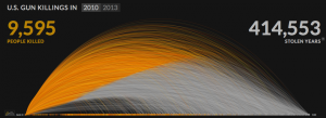
Jennifer sent me a link to an animated visualization of U.S. Gun Killings in 2010. The visualization shows the years lost by people being killed with guns. It animates their lives as arcs that change at the moment of death, but continue so that you can see how long they might have lived.
This visualization shows how animation can add to a visualization. In this case it adds drama and a sense of the individual lives. In many cases animation hides information as much as it shows like a slide show that hides one slide to show another. I’m convinced animated visualizations can do more, but haven’t come across that many.
The Expression of Emotions in 20th Century Books
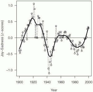
Emilie pointed me to an NPR strory on mining mood in 20th century books, Mining Books To Map Emotions Through A Century. This story draws on a very readable article The Expression of Emotions in 20th Century Books in PLOS One. The article reports on a study of “mood” or sentiment over time in literature. The used the Google Ngram data. I like how they report first and then discuss methodology at the end.
They mention support from an interesting EU funded project TrendMiner. TrendMiner is developing real-time multi-lingual analysis tools.
Continue reading The Expression of Emotions in 20th Century Books
The Cube at QUT – world’s biggest multitouch installation
Luciano sent me this link to a stunning multipoint touch installation at Queensland University of Technology, Brisbane, The Cube at QUT – world’s biggest multitouch installation. I like how they have the touch at ground level, but the screen extends up.
I note that the Cube folk also have a Lego Education Learning Centre. I’m doubly envious.
The TEI at Work Animation using gource
Martin Holmes uploaded a neat animation of a visualization of The TEI Council at Work that shows version editing of the TEI documents.
The animation is generated by gource – software version control visualization.
A Thousand Words
The Texas Advanced Computing Center has created an Advanced Visualization for the Humanities tool for a project A Thousand Words. The tool, called Most Pixels Ever: Cluster Edition is a library that extends Processing and is designed for large-scale tiled displays. Very neat.

