Buxton Collection of Input Devices

PivotViewer

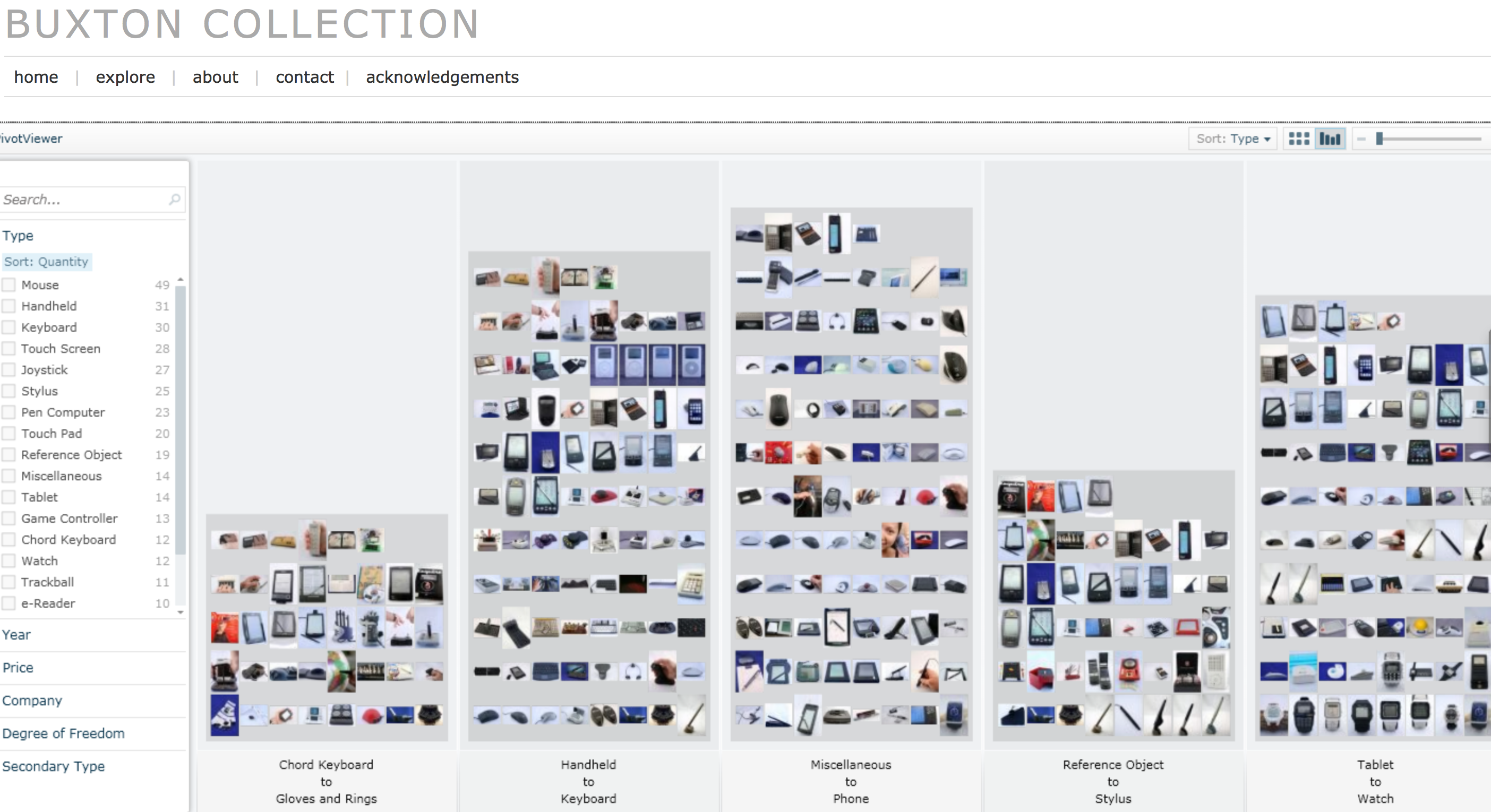
Bill Buxton has made available his collection his Buxton Collection of Interactive Devices. This collection of input and touch devices like chord keyboards, watches, pen computers, and joysticks. I saw some of his collection when at GRAND in 2011 as he mounted a display for CHI 2011 which took place right before.

What is doubly interesting is the Microsoft Silverlight PivotViewer which is for exploring large sets of visual objects. You can explore the Buxton Collection with Pivot if you install Silverlight. Apparently Pivot is discontinued, but you can still try it on the Buxton Collection.

The interface of the PivotViewer reminds me of Stan Ruecker’s work on rich prospect browsing. He developed an interface that always keeps the full set of objects in view while drawing some forward and minimizes others.

Fragmented Memory | Phillip Stearns

From Elijah Meeks’ hackathon at the Texas Digital Humanities Conference I learned about Fragmented Memory by Phillip Stearns. This is a project that takes binary data and then turns it into weaving instructions using Processing. Here is one of the large tapestries woven (and available for sale.)

If you can’t afford a $15,000 tapestry, there are also cheaper blankets here.

I’ve just put them on my Christmas list (which I can never find in time.)

Humanities Visualization Service at Texas

Texas A&M University held a Humanities Visualization Service Grand Opening at the Initiative for Digital Humanities, Media, and Culture. One of the visualizations they showed used Voyant (see above.) It is interesting to think about how visualizations should be designed for large screens seen by groups of people. With others I presented on this subject at the Chicago Colloquium – see The Big See: Large Scale Visualization. I am not convinced that very high-resolution screens/projectors and tiled data walls (like what they have at the IDHMC) will become the norm. We need to develop visualization tools so that they can scale up to walls and for groups.

Data Visualization: Looking back, going forward

D-Lib Magazine has a Featured Digital Collection in this issue. See the right-hand column of the Table of Contents for January/February 2014. The featured collection is DataVis.ca, a terrific site about visualization that has been organized by Michael Friendly at York University. The site is nicely organized and pays attention to the history of visualization. (The image above is the “first (known) statistical graph – from 1644 by Michael Florent van Langren.)

I’m not only impressed by the DataVis.ca site, but also that D-Lib is featuring sites, something I didn’t notice before. This is a nice way to recognize work (web archives) that are difficult to formally review.

Kindred Britain

Susan alerted me to an interesting interactive of Kindred Britain that lets you see how different luminaries in British history are connected. This interactive is difficult to use at first. You should really go though the tutorial that opens immediately as the visualizations and controls are not obvious. Once you do you are rewarded with a three layered visualization:

  • Network
  • Timeline, and
  • Geography

These layers are linked so manipulating one changes things in the others. The authors have written essays on what they did.

Wikileaks – The Spy files

On December 1st, 2011 Wikileaks began releasing The Spy files, a collection of documents from the intelligence contractors. These documents include presentations, brochures, catalogs, manuals and so on. There are hundreds of companies selling tools to anyone (country/telecom) who wants to spy on email, messaging and phones. I find fascinating what they should about the types of tools available to monitor communications, especially the interfaces they have designed for operatives. Here are some slides from a presentation by Glimmerglass Networks (click to download entire PDF).

Continue reading Wikileaks – The Spy files

The Wedding Data: What Marriage Notices Say About Social Change

Reading a collection of stories in the Atlantic about women and technology I came across a story about The Wedding Data: What Marriage Notices Say About Social Change. This article talks about Weding Crunchers – a database of New York Times wedding announcements since 1981 that you can search in an environment much like Google’s Ngram viewer. In the chart above you can see that I searched for different professions. Note how “teacher” takes off, probably because of the popularity of Teach for America.

I can’t help wondering if we are seeing the emergence of a genre of text visualization – the diachronic word viewer. This type of visualization depends on an associations between orthographic words (the actual words in texts) and concepts.

Reshaping New York

The New York Times has a fabulous new interactive visualization called Reshaping New York that shows how Bloomberg has changed the city of 12 years. It shows new buildings, the rezoning, the introduction of bike lanes, and the celebration of the waterfront. The visualization is more of a tour that combines a 3D model of the city with images of before and after Bloomberg.