Kindred Britain

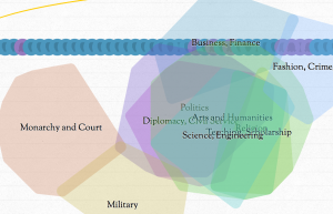
Susan alerted me to an interesting interactive of Kindred Britain that lets you see how different luminaries in British history are connected. This interactive is difficult to use at first. You should really go though the tutorial that opens immediately as the visualizations and controls are not obvious. Once you do you are rewarded with a three layered visualization:

  • Network
  • Timeline, and
  • Geography

These layers are linked so manipulating one changes things in the others. The authors have written essays on what they did.

Wikileaks – The Spy files

On December 1st, 2011 Wikileaks began releasing The Spy files, a collection of documents from the intelligence contractors. These documents include presentations, brochures, catalogs, manuals and so on. There are hundreds of companies selling tools to anyone (country/telecom) who wants to spy on email, messaging and phones. I find fascinating what they should about the types of tools available to monitor communications, especially the interfaces they have designed for operatives. Here are some slides from a presentation by Glimmerglass Networks (click to download entire PDF).

Continue reading Wikileaks – The Spy files

The Wedding Data: What Marriage Notices Say About Social Change

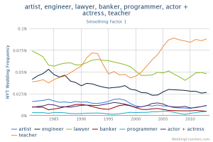
Reading a collection of stories in the Atlantic about women and technology I came across a story about The Wedding Data: What Marriage Notices Say About Social Change. This article talks about Weding Crunchers – a database of New York Times wedding announcements since 1981 that you can search in an environment much like Google’s Ngram viewer. In the chart above you can see that I searched for different professions. Note how “teacher” takes off, probably because of the popularity of Teach for America.

I can’t help wondering if we are seeing the emergence of a genre of text visualization – the diachronic word viewer. This type of visualization depends on an associations between orthographic words (the actual words in texts) and concepts.

Reshaping New York

The New York Times has a fabulous new interactive visualization called Reshaping New York that shows how Bloomberg has changed the city of 12 years. It shows new buildings, the rezoning, the introduction of bike lanes, and the celebration of the waterfront. The visualization is more of a tour that combines a 3D model of the city with images of before and after Bloomberg.

Multipoint Touch Variorum

MtV on Vimeo on Vimeo

Luciano Frizzera has put the video up that he showed at Digital Humanities 2013 in our INKE panel. His video shows his multi-point touch variorum edition prototypes. He has been prototyping how we could use gestures on large screens, especially tables. He has interesting ideas about how people can discuss something on different sides of a table.

Data Analytics’ Next Big Feat: Sarcasm Detection

Slashdot has a story about Data Analytics’ Next Big Feat: Sarcasm Detection. The BBC article that this draws from says the French company Spotter has algorithms for 29 different languages and that they can “identify sentiment up to an 80% accuracy rate.”


A screen shot from Spotter shows a tool running on an iPad with a word cloud for exploration and selection tools.

The same Slashdot story sent me also to a Wall Street Journal story about how the Obama 2012 campaign used Salesforce for sentiment analysis on email coming into the campaign.

Visualizing Collaboration

Ofer showed me a interactive visualization of the collaboration around a Wikipedia article. The visualization shows the edits (deletions/insertions) over time in different ways. It allows one to study distributed collaborations (or lack thereof) around things like a Wikipedia article. The ideas can be applied to visualizing any collaboration for which you have data (as often happens when the collaboration happens through digital tools that record activity.)

His hypothesis is that theories about how site-specific teams collaboration don’t apply to distributed teams. Office teams have been studied, but there isn’t a lot of research on how voluntary and distributed teams work.

World Development Indicators – Google Public Data Explorer

Ryan sent me a link to World Development Indicators – Google Public Data Explorer. This is a great visual data explorer with lots of data already available. It looks like the Gapminder Trendanalyzer, which Google bought in 2007. (Gapminder is now focused on keeping statistical data up-to-date and producing related media.) In Google Public Data you can search for datasets and then play with the type of visualization and so on. I’m struck by how this model of weaving datasets and tools together works so simply with the tools adapting to the datasets. I wonder if we could do something like this for texts?

Gapminder’s Hans Rosling has a TED talk on Stats that reshape your worldview that is worth watching where he talks about preconceptions we have about the world. He is really good at showing how much things have changed so that preconceptions true in the 1960s are not longer valid.

As Megan Garber explains in Dataviz, democratized: Google opens Public Data Explorer, one of the things Google has done is to now allow us to upload our data too, so this ceases to be such a passive interpretation tool. The trick is the Dataset Publishing Language that lets uploaders describe their data so the Public Data Explorer can present it properly.

U.S. Gun Killings in 2010

Jennifer sent me a link to an animated visualization of U.S. Gun Killings in 2010. The visualization shows the years lost by people being killed with guns. It animates their lives as arcs that change at the moment of death, but continue so that you can see how long they might have lived.

This visualization shows how animation can add to a visualization. In this case it adds drama and a sense of the individual lives. In many cases animation hides information as much as it shows like a slide show that hides one slide to show another. I’m convinced animated visualizations can do more, but haven’t come across that many.