In Dublin I heard DAH student Maura McDonnell present on Visual Music (her blog), which is her PdD research area. Visual Music is one term among many of experiments in light and sound and her blog is a nice collection of resources on this new media form.
From her blog I learned that there is a also a Center for Visual Music that has documentation and an online store.
Maura’s own work can be seen online, see Silk Chroma. The image above is taken from the Vimeo video.
Jennifer sent me a link to what sounds like a phenomenal Eyeo Festival in Minneapolis last summer. While I didn’t attend, I am watching the Eyeo2012 Vimeo channel. These are some of the most creative people at the intersection of art and computing.
From Humanist I just learned about Juxta Commons. This is a web version of the earlier downloadable Java tool. The new version still has the lovely interface that shows the differences between variants. The commons however, builds on the personal computer tool by being a place where collations can be kept. Others can find and explore your collations. You can search the commons and find collation projects.
Another interesting feature is that they have Google ads if you search the commons. The search is “powered by Google” so perhaps that comes with the service.
Stéfan pointed me to this new visualization library, D3.js – Data-Driven Documents. The image above is from their Co-Occurrence Matrix (of characters in Les Misérables.) Here is what they say in the About:
D3.js is a JavaScript library for manipulating documents based on data. D3 helps you bring data to life using HTML, SVG and CSS. D3’s emphasis on web standards gives you the full capabilities of modern browsers without tying yourself to a proprietary framework, combining powerful visualization components and a data-driven approach to DOM manipulation.
Take a look the examples Gallery. There are lots of ideas here for text visualization.
From Melissa and Twitter a great visualization of London Lives on the Line. It shows life expectancy and poverty by the tube stops of London. It shows the rhetorical power of visualization to connect data to our lives.
Gartner has an interesting Hype Cycle Research methodology that is based on a visualization.
When new technologies make bold promises, how do you discern the hype from what’s commercially viable? And when will such claims pay off, if at all? Gartner Hype Cycles provide a graphic representation of the maturity and adoption of technologies and applications, and how they are potentially relevant to solving real business problems and exploiting new opportunities.
The method assumes a cycle that new technologies take from:
The latest version of our Old Bailey Datawarehousing Interface is up. This was the Digging Into Data project that got TAPoR, Zotero and Old Bailey working together. One of the things we built was an advanced visualization environment for the Old Bailey. This was programmed by John Simpson following ideas from Joerg Sanders. Milena Radzikowska did the interface design work and I wrote emails.
One feature we have added is the broaDHcast widget that allows projects like Criminal Intent to share announcements. This was inspired partly by the issues of keeping distributed projects like TAPoR, Zotero and Old Bailey informed.
As I mentioned in my post on the GRAND conference, Ken Perlin showed a number of interesting Java apps that illustrated visual ideas. One was a Interactive Map of Pride and Prejudice. This interactive map is a rich prospect of the whole text which you can move around to see particular parts. You can search for words (or strings) and see where they appear in the text. You can select some text and it searches. The interface is simple and intuitive. You can see how Perlin talks about it in his blog. I also recommend you look at his other experiments.
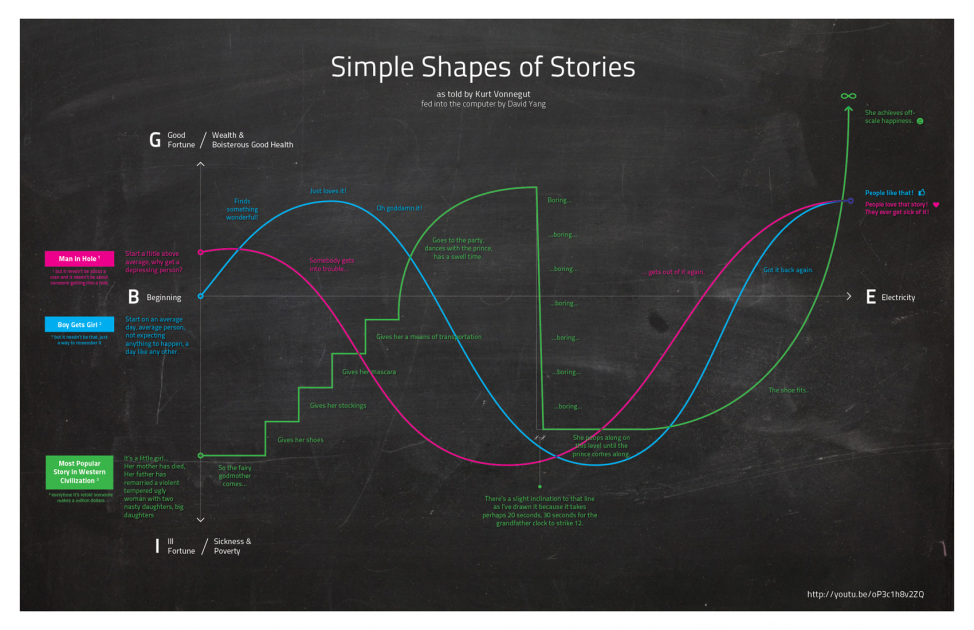
I’ve been meaning to blog on the video circulating of Kurt Vonnegut talking about the Shape of Stories. He describes the curves followed by popular stories like “boy meets girl” and suggests computers could even understand such simple curves. In Lapham’s Quarterly you can read the text of this lecture with illustrations. See Kurt Vonnegut at the Blackboard. In this version he asks about the value of such systems, a question which could apply equally to computer generated visualization,
The question is, does this system I’ve devised help us in the evaluation of literature? Perhaps a real masterpiece cannot be crucified on a cross of this design. How about Hamlet?
He concludes that the system doesn’t work because the truth is ambiguous. We simply don’t know in complex works (like Hamlet) if news is good or bad. Good literature is open to interpretation.
But there’s a reason we recognize Hamlet as a masterpiece: it’s that Shakespeare told us the truth, and people so rarely tell us the truth in this rise and fall here [indicates blackboard]. The truth is, we know so little about life, we don’t really know what the good news is and what the bad news is.
Prism is the coolest idea I have come across in a long time. Coming from the University of Virginia Scholar’s Lab, Prism is a collaborative interpretation environment. Someone comes up with categories like “Rhetoric”, “Orientalism” and “Social Darwinism” for a text like Notes on the State of Virginia. Then people (with accounts, which you can get freely) go through and mark passages. This creates overlapping interpretative markup of the sort you used to get with COCOA in TACT, but unlike TACT, many people can do the interpretation – it can be crowdsourced.
They are planning some visualizations of the results including what look like the types of visualizations that TACT gave where you can see words distributed over tagged areas.