Stephen Wolfram Blog : The Personal Analytics of My Life

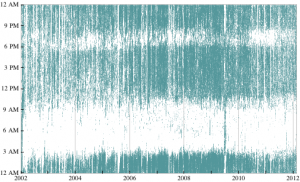
Thanks to Bethany on twitter I came across this great post by Stephen Wolfram on The Personal Analytics of My Life. Wolfram is not the first person to use computers to track his activities and then understand himself. Microsoft Research has a project MyLifeBits that is “an attempt to fulfill Vannevar Bush‘s vision of an automated store of the documents, pictures (including those taken automatically), and sounds an individual has experienced in his lifetime, to be accessed with speed and ease.” The project is digitizing and following Gordon Bell and they have released a book Your Life, Uploaded. We could even go back to the ancient Greek aphorism “Know theyself” that motivated Socrates and which, in its Latin form (temet nosce), shows up over the door of the Oracle in the Matrix.

Continue reading Stephen Wolfram Blog : The Personal Analytics of My Life

WordSeer

Stéfan pointed me to Berkley WordSeer a text analysis tool “that includes visualizations and works on the grammatical structure of text.” You can watch the video with Aditi Muralidharan talking about the project. She sees the problem with traditional search being the way keyword reading models texts as a bag of words. What we can’t do is model text as sentences. In other words she wants to leverage natural language processing to enhance search so you can see how “God” is described or what she/he has done. There are also some visualization tools like a heat map and word tree.

There is a nice YouTube video demoing how to use WordSeer to explore “beautiful” in Shakespeare.

Pipelines Meeting

At the inaugural Edmonton Pipelines meeting I’ve learned a lot about different spatial projects. Some include:

  • City of Edmonton Open Data Catalogue. Edmonton has a great open data initiative. They not only make data sets available, they also have visualization tools that you can use to
  • Experimental Geography in Practice. This is the blog of Merle Patchett a postdoctoral fellow who is working on a number of projects including one where she is interviewing people about their suburban memories.
  • Becoming Literate in Space and Time. Margaret Mackey is doing a close and personal reading of her literacy. She is, among other things, mapping her childhood literacy.

The Edmonton Pipelines project is SSHRC funded. They are interested in community engagement which is why they organized the inaugural meeting and invited researchers in the city doing work with geography. They chose the name “pipelines” to play with the idea of how data is changed over space. They have a number of subprojects including one on Queer Edmonton that I am interested in as we are working with Pipelines on a locative game that exposes people to the queer history of Edmonton.

Ruecker on Visualizing Time

Stan Ruecker gave a great talk today about Visualations in Time for the Humanities Computing Research Colloquium. He is leading a SSHRC funded project that builds on Drucker and Noviskie’s work on Temporal Modelling. (I should mention that I am on the project.) Stan started by talking about all the challenges to the linear visualization of time that you see in tools like Simile. They include:

  • Uncertainty: in some cases we don’t know when it took place.
  • Relative time: how do we visualize all the ways we talk about time as relative (ie. events being before or after another)?
  • Phenomenological time: how do we represent the experience of time.
  • Reception: there is not only the time something happens but the time it is read or received.

Stan then showed a number of visual designs for these different ways of thinking about time. Some looked like rubber sheets, some like frameworks of cubes with things in them, and some like water droplets. Many of these avoided the “line” in the visualization of time.

Guardian visualization: Anders Breivik’s spider web of hate

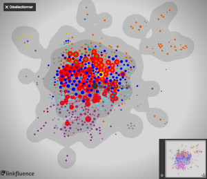
The Guardian has an interesting visualization of Anders Breivik’s manifesto mapped by linkfluence. Andrew Brown explains what they learned from the visualization in an article Anders Breivik’s spider web of hate (Sept. 7, 2011). The visualization shows the network of links from Breivik’s manifesto to other types of sites. There are a large number of links to mainstream media and to the Wikipedia, but also a number to other right wing sites. As Brown puts it,

The Guardian has analysed the webpages he links to, and the pages that these in turn link to, in order to expose a spider web of hatred based around three “counter-jihad” sites, two run by American rightwingers, and one by an eccentric Norwegian. All of these draw some of their inspiration from the Egyptian Jewish exile Gisele Littman, who writes under the name of Bat Ye’or, and who believes that the European elites have conspired against their people to hand the continent over to Muslims.

The Garden of Error and Decay

The Garden of Error and Decay is a real-time visualization of disasters mentioned in Twitter and other feeds. The text about the interactive says “this innovative moving image format is something like a real-time data driven narrative. This project is not a film, not a game, and not a nonlinear interactive story.” The visualization uses pictograms that represent the type of disaster. You can see the original twitter text.

Thanks to Scott for this.