evolt.org – Browser Archive is a collection of archaic browsers (if archaic is the word for tools hardly more than a decade old.) Adrian Roselli has put up the archive of executables. He explains it in a post Browser archive now live. Thanks to James for this.
Category: Interface Design and Usability
Many Eyes
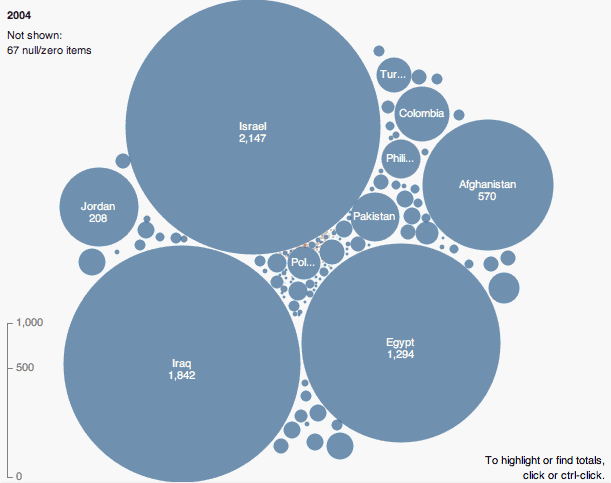 Many Eyes is an IBM site for shared visualization and discovery. If you get an account you can upload data sets and then try different visualization tools on them. Others can create visualizations from your dataset and/or can leave comments on a visualization. See for example this visualization of bible names.
Many Eyes is a bet on the power of human visual intelligence to find patterns. Our goal is to “democratize” visualization and to enable a new social kind of data analysis. Jump right to our visualizations now, take a tour, or read on for a leisurely explanation of the project. (From About Many Eyes)
What is interesting is the “democratic” nature of the site – a sort of Flickr for visualization.
Thanks to Judith for pointing me to this.
Office Inteface
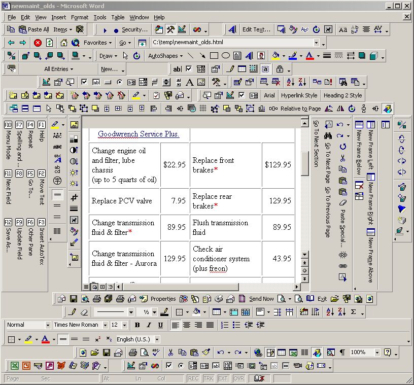 The DigiBarn Computer Museum has a collection of amusing Screenshots Funstuff including this shot of Word with so many toolbars turned on that they frame the content. Toolbars gone wild.
iPhone: Is it magic?
Mike Elgan has an article on iPhone: 20 things we don’t know (Jan. 12, 2007) in Digit a magazine about “the future of digital design”. In particular I agree with his questions about the touch screen interface and virtual keyboard – will it be responsive enough for Blackberry users who do push e-mail?
 One way of asking about the iPhone is to think about the Newton PDA which was also supposed to be a magical reinvention of personal computing. Like the iPhone, and unlike the iPod, it tried to do lots of things and as a result didn’t do anything well. The Palm Pilot got the PDA market right by doing fewer things very well and in a small enough package to fit in your pocket. As pretty and desirable as the iPhone is, I worry that it will be a delicate and fat phone; a slow and poor Internet device; and an expensive iPod with little memory.
That said, it will shakeup the cell phone business. If it doesn’t take off, someone else will get the need for new designs and digital integration right.
Update: Shawn pointed me to an article Apple Ushers in Era of the Fluid UI by Om Malik. Malik correctly, I think, identifies the fluid interface as the important innovation.
GUIdebook: Graphical User Interface gallery
 GUIdebook: Graphical User Interface gallery is a great resource on the history of GUIs. It has great charts comparing things like component icons for text editors across time and across different GUIs. It documents the evolution of GUIs from the Mac OS to historic ones like the Amiga OS. It has ads, sounds for Windows (like the startup sound) and links to articles. It only has a couple of applications documented (iTunes and Photoshop), but it is still a must see.
Don’t Click It: Interaction Research
 www.dontclick.it is a site both about research into interaction (and clicking) and an example of how one doesn’t need to click to interact. You navigate the Flash site using gestures, it discusses the question of clicking and alternatives, and it tracks mouse movement.
There is a nice moment when it asks you a quick survey which, of course, I clicked on, at which point it reminds you not to click.
This is thanks to Nick.
Deja Vu: (re-)creating web history
 Deja Vu: (re-)creating web history is a site that presents a timeline of browsing history emulations of different browser interfaces. It tries to give you a sense of evolution of the interface. Of course there is the Internet Archive if you want to see old site designs.
Pathway – Wikipedia Visualization
 Pathway is a small custom application (just for Max OS X) that creates a visualization while you browse the Wikipedia. It is not a general pupose browser, it is just for the Wikipedia, but it includes some nice features for reflecting on the “path” you take through the wiki. I should note that paths are a feature Vannevar Bush talked about in “As We May Think” (Atlantic Monthly, July 1945.)
This comes from Matt.
Crazy Egg – visualize usage
 When I was showing students the Nielsen F-Pattern Alertbox one of them pointed me to Crazy Egg ‚Äì visualize your visitors – a neat service that watches user’s clicks on your pages and then shows you the results in overlays like the heatmap example here.
Nielsen: F-Shaped Pattern For Reading Web Content
 There is an F-Shaped Pattern to the way users read the web according to one of Jakob Nielsen’s Alertbox columns on usability. The Alertbox reports on a study that used eye tracking to see where users looked on a web page.
The study has implications for writing for the web if Nielsen is right that viewers typically scan a page in an “F” pattern where they scan a couple times horizontally and then vertically down.