How to visualize news? Phylotaxis by Jonathan Harris (who also did 10X10) is blog/news visualizer designed for Seed: Science is Culture magazine. I think I am going to start a Jonathan Harris fan club – all of his work is perfect in its simplicity and effectiveness.
Category: Visualization
Power of Words Visualization
The Power Of Words is a project by students of my colleagues StÈfan Sinclair. It is both interesting visually and relevant to current events. I am impressed by the work his students are doing. I found it on his blog entry, The Power of Words.
MLA Language Map
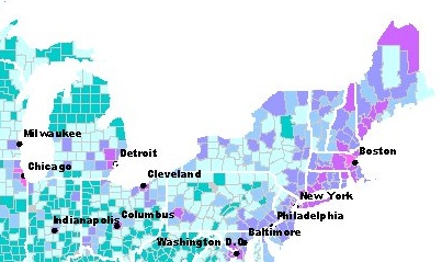
French in the North East of the USA
The Modern Languages Association has a nice Language Map that you can use to see the distribution of different languages by county in the US. It uses census data from 2000. They also have tools for getting data for states and cities to compare language use.
typorganism: Learning about type
 …t.y.p.o.r.g.a.n.i.s.m… is a very cool site that “focuses on interactive kinetic typography” based on the idea that “Type is an Organism”. I particularly like the “ASCII-O-Matic” where you can upload an image (or your face, for example) and see it rendered in type.
Historical Visualizations
Matt Jensen of NewsBlip has pointed me to work he and others are doing on historical visualization. See, for example, the technical report on Semantic Timelines that he wrote. Historical Visualizations, by David Staley in the JAHC: Journal of the Association for History and Computing (vol. III, no. 3, Nov. 2000) surveys the ways visualization is used in history from concepts to timelines.
Another similar project is the Temporal Modelling project led by Johanna Drucker. She and Bethany Nowviskie have been working on visual forms of knowledge production. See their Prototype Designs for a temporal vocabulary which I blogged earlier at 3D Timelines.
flowerGarden
flowerGarden by greg judelman is a “web-baed software application, produced in Flash, for real-time soica network and conversation visualization.” It produces a TextArc like visualization of people in conversation and concepts they discussed. Judelman uses a flower of petals for people in a way that makes the visualization look like a garden of words with flowers blossoming. This is thanks to Bethany Nowviskie.
Metacombine Multidimensional Visualization Project
 The Metacombine Multidimensional Visualization Project has been developing Java interactive visualizations for digital libraries. They use prefuse: an interactive visualization toolkit to create the multi-dimensional visualizations. They also have a good section on the dimensionality reduction techniques they use like principal component analysis.
Dogpile: Search Comparison Visualization
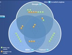
StÈfan has a blog entry on Dogpile Search Comparitor tool which produces a venn diagram of the results from different search engines. The interface, however, has a fatal flaw. You can’t link to the resulting sites that are common to more than one search engine (and presumably are the ones you want). The little pills in the middle – which stand for the shared results link to a Dogpile listing, not to the resulting site itself.
Buzztracker: News location visualization
buzztracker is an interesting visualization of Google News that is mapped onto a map of the world to show the places in the news and their relationships.
Leximancer

Leximancer is a text mapping and mining application that creates visualizations of texts that can be made available over the web in interactive form. See the Leximancer Gallery.
Continue reading Leximancer