 Clickstream Data Yields High-Resolution Maps of Science is an article that presents an interesting view of the interdisciplinary relationships between the humanities and social sciences, on the one hand, and the sciences on the other. The article used “clickstream” data or usage data collected at various scholarly portals that show not citation links but connections in the activities of the users.
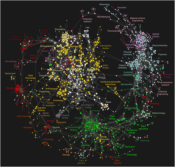
The resulting model was visualized as a journal network that outlines the relationships between various scientific domains and clarifies the connection of the social sciences and humanities to the natural sciences.
They describe the visual appearance of the visualization (above) thus,
To provide a visual frame of reference, we summarize the overall visual appearance of the map of science in Fig. 5 in terms of a wheel metaphor. The wheel’s hub consists of a large inner cluster of tightly
connected social sciences and humanities journals (white, yellow and gray). Domain classifications for the journals in this cluster include international studies, Asian studies, religion, music, architecture and design, classical studies, archeology, psychology, anthropology, education, philosophy, statistics, sociology, economics, and finance. The wheel’s outer rim results from a myriad of connections in M’ between journals in the natural sciences (red, green, blue). In clockwise order, starting at 1PM, the rim contains physics, chemistry, biology, brain research, health care and clinical trials journals. Finally, the wheel’s spokes are given by connections in M’ that point from journals in the central hub to the outer rim.
This article came out of work funded by Mellon at the MESUR project.