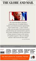
The paper I read every morning, The Globe and Mail has twice in the last week (today, Nov. 2, and Saturday past) had a highly designed front page focused on just one story. They are going “layout crazy” where they don’t present the news, but instead try to get attention. Why?
My guesses are the following:
- They think interesting designs will sell papers off the stands to people who don’t typically buy them.
- They are worried that subscribers are not reading the papers they get unless they can create an attractive font page that sucks them in.
- It is a trend sweeping the industry – form over news is the innovative thing to do.
- They think that the way to compete with the web is to look more like a designed magazine.
- The issue is so important they want to signal that this issue is devoted to the Gomery Report and should be treated like a special edition.
The problem is that subscribers who regularly read the paper like myself find this trend a waste of paper and time. The Gomery Report has been consuming space in the Globe for weeks – I’m not likely to miss the importance of the release of the report. I like my front page to be a summary of the news with stories that lead from there on other pages. I buy magazines for what they offer and dailies for the news. What a good front page can offer, which the web cannot, is a lot of information on one page. Why waste that asset? Why alienate the core subscribers in order to attract the restless who don’t subscribe anyway? The Globe should set their designers the challenge of how to get as much information on the front page as possible rather than as little as possible. It doesn’t make for award winning designs, but it makes for a well designed paper!