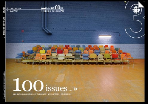
One of the best designed web magazines, the CBCRadio3.com Magazine site has “published” its last issue. An article in the Globe and Mail by Alexandra Gill, “CBC Radio Three’s lauded Web mag dies” (March 5, 2005, Page R5) nicely points out the irony of CBC killing this award winning radio site just when others are moving in.
I know from my students that the site had the attention of the youth demographic (or at least some of them.) It was an attempt to reach youth in a way that CBC Radio 1 and 2 didn’t. It was a multimedia magazine with music, arts, and essays rather than a radio show. The site lets you listen to music (and control it) as you read the mag – a bit like having the radio you listen to and the magazine you thumb through coordinated. The interface design was brilliant and immediately intriguing, even if difficult to figure out initially.
Why CBC is killing it is not clear. Perhaps not enough people want to watch radio off the screen or perhaps they want to get out of online media and stick to radio. Podcasts will be next.
Category: Interface Design and Usability
In Memory of Jef Raskin
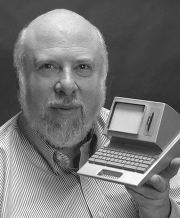
Jef Raskin, arguably one of the pioneers of personal computer interfaces, has passed away. See his site, Jef Raskin – Welcome to JefRaskin.com.
For a notice on his passing see, Press Release, February 27, 2005 or TidBITS: In Memoriam: Jef Raskin, 1943-2005.
I became aware of Jef when reading about the Canon Cat (in Byte I think); I was pleased to see that the Canon Cat Manual is on the site.
Negroponte Cheap PC project
Yet another cheap computer for the rest of the world initiative. This time a Linux box that around $100 USD. See The hundred-buck PC. This came to me from Matt Patey.
d’art Design Group: Interface by group94
Drew Paulin drew my attention to an interesting interface for the D’ART DESIGN GRUPPE which was deisnged by group94 / webdesign from belgium who have their own neat interface.
I was talking with a web designer over the weekend about why he doesn’t have a web site. His take was that you don’t get jobs from your web site – at most it acts like a online portfolio, and one that takes lots of work to keep up to date. That said, it seems some of the most creative web works are those by design groups to show off their creativity.
Centre for Global Dialogue: Virtual Themeworld
VIRTUAL THEMEWORLD is a shards and space interface to themes about global governance and risk. I think this is meant to be the neat showcase interface for the Swiss Re Centre for Global Dialogue. (Swiss Re is a reinsurance company.) The Themeworld is a Shockwave based interface for exploring linked themes that when you first enter feels like Asteroids in colour.
Jan. 28 Update – I got an e-mail from the creator of Themeworld, Matt Bindoff of .bindoff. He justifiably corrected me that it is Shockwave based not Flash. If, like me, you are fuzzy on the difference see, Macromedia – What’s the difference between Shockwave and Flash?
Apple and the Mini Mac
The Saturday Globe has a beg story on the Mac mini, Jobs and Apple, Globetechnology: We’re in the era of Jobs II (Saturday, Jan. 15, 2005, by David Akin). In a companion peice online, that is a “Globe and Mail Update” titled, Apple jabbed by price point, Jack Kapica makes the point that the price point of $499 that Apple is hitting in the US doesn’t work for Canada when it becomes $630 Canadian. He also complains about the price for Apples, though that’s another story.
What no one noticed is that Mac mini is not that far from an iPod. Could Apple adapt the mini by adding a small LCD and battery to turn it into a Mac response to something like the OQO? At some point of miniaturization I won’t be synching my iPod with my computer, my iPod will be the computer that I dock when at the office and listen to on the way home.
Scrolling foldout from at site on Lissitzky
I found an interesting use of HTML and Javascript while browsing this site on the Russian Futurist designer El Lissitzky (1890-1941), “Monuments of the Future”: Designs by El Lissitzky (Getty Research Institute). For the catalogue of the Soviet Pavilion’s installation at the International Press Exhibition in Cologne in 1928, Lissitzky designed an accordion foldout of photomontages. The Getty Research Institute page for this foldout lets you scroll right across the panels of the foldout.
I’m not sure about the rest of the design for the site with its use of frames, but the information and images make this a first rate research site.
An interesting feature of the site is that you can compare HTML (“Common Format”) and Flash (“Enhanced”) versions. To my mind the HTML is better; I’m not sure what is enhanced about the Flash version.
OQO: Mini PC
The OQO is a cute miniature full PC which may blow PDAs out. The oqo: video shows it off, but also has a neat little visual history of the computer from the ENIAC to the Mac. I’m ready to buy one.
This is thanks to Laue, just a text ª OH-cue-oh.
Sabine Scholl: Book Interface
Sabine Scholl has a simple and interesting interface to her personal site which looks like a very tall book that you can scroll up and down. I don’t know if it is intentional, but there is a visual joke on flipping pages and scrolling up and down to the site. All the links are just to anchors further down the “page”. This is courtesy of Ross Scaife.
How to use a book
http://homepages.nyu.edu/~mz34/helpdesk.WMV is a video clip in Danish that is a very funny look at the technology of the book. One of the funniest things I have seen in a while and I don’t understand Danish. This came via the TEI-L and Matthew Zimmerman. We need an English version.
Update: Philip sent me a link to a YouTube version with English subtitles. Somehow it isn’t quite as funny.