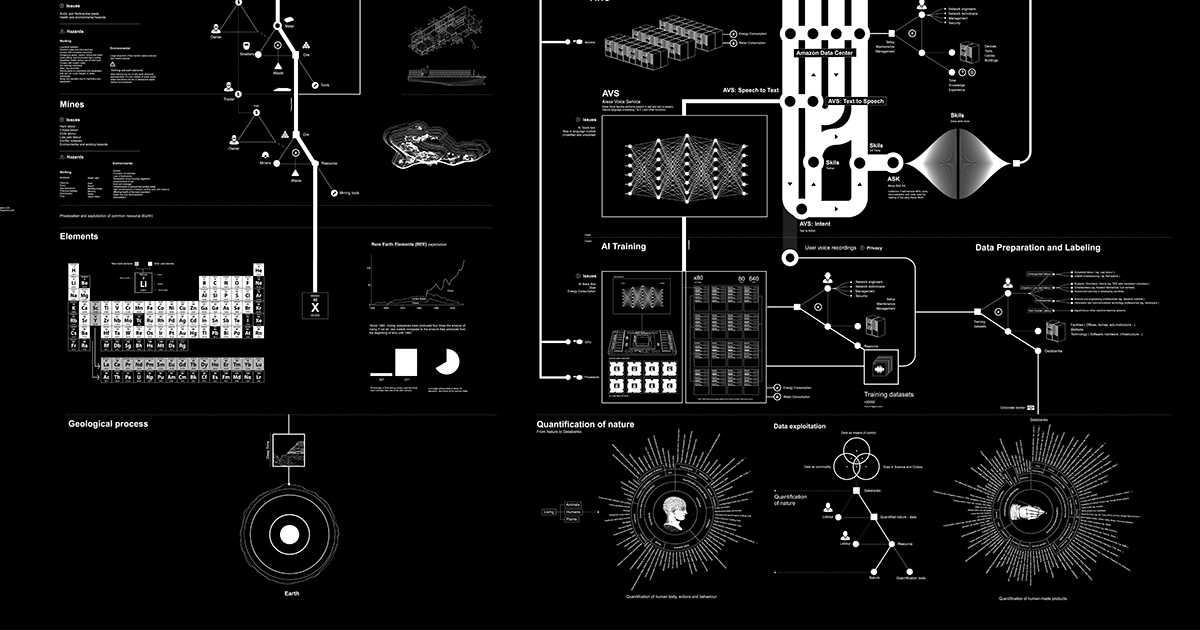
Anatomy of an AI System – The Amazon Echo as an anatomical map of human labor, data and planetary resources. By Kate Crawford and Vladan Joler (2018)
Kate Crawford and Vladan Joler have created a powerful infographic and web site, Anatomy of an AI System. The dark illustration and site are an essay that starts with the Amazon Echo and then sketches out the global anatomy of this apparently simple AI appliance. They do this by looking at where the materials come from, where the labour comes from (and goes), and the underlying infrastructure.
Put simply: each small moment of convenience – be it answering a question, turning on a light, or playing a song – requires a vast planetary network, fueled by the extraction of non-renewable materials, labor, and data.
The essay/visualization is a powerful example of how we can learn by critically examining the technologies around us.
Just as the Greek chimera was a mythological animal that was part lion, goat, snake and monster, the Echo user is simultaneously a consumer, a resource, a worker, and a product.
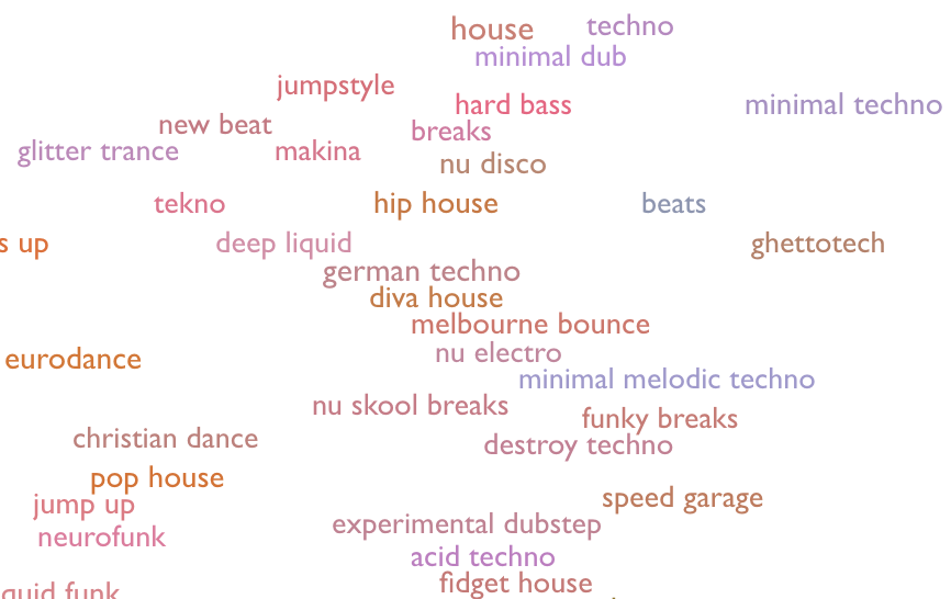
Ted Underwood in a talk at the Novel Worlds conference talked about a fascinating project, Every Noise at Once. This project has tried to map the genres of music so you can explore these by clicking and listening. You should, in theory, be able to tell the difference between “german techno” and “diva house” by listening. (I’m not musically literate enough to.)
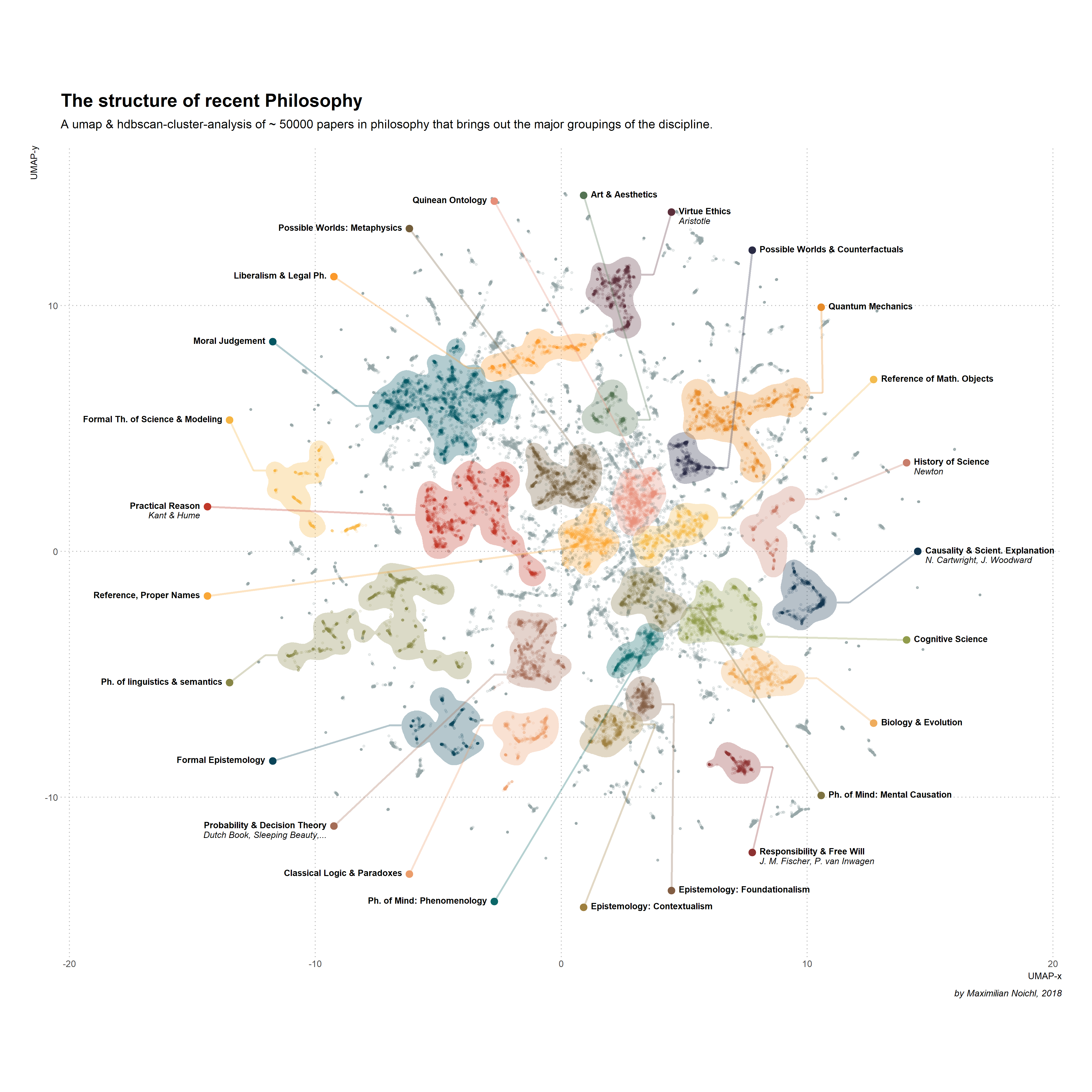
In this codebook we will investigate the macro-structure of philosophical literature. As a base for our investigation I have collected about fifty-thousand reco
Stéfan sent me a link to this interesting post, The structure of recent philosophy (II) · Visualizations. Maximilian Noichl has done a fascinating job using the Web of Science to develop a model of the field of Philosophy since the 1950s. In this post he describes his method and the resulting visualization of clusters (see above). In a later post (version III of the project) he gets a more nuanced visualization that seems more true to the breadth of what people do in philosophy. The version above is heavily weighted to anglo-american analytic philosophy while version III has more history of philosophy and continental philosophy.
There was a striking difference in style — and substance.
Vox has a nice interactive visualization of Every time Ford and Kavanaugh dodged a question, in one chart. The two visualizations, one for Ford and one for Kavanaugh, show at a glance how the latter dodged a lot more questions. You can click on the sections which are marked as dodgy and see the full text. Nice clear use of visualization to tell a larger story and let the user explore.
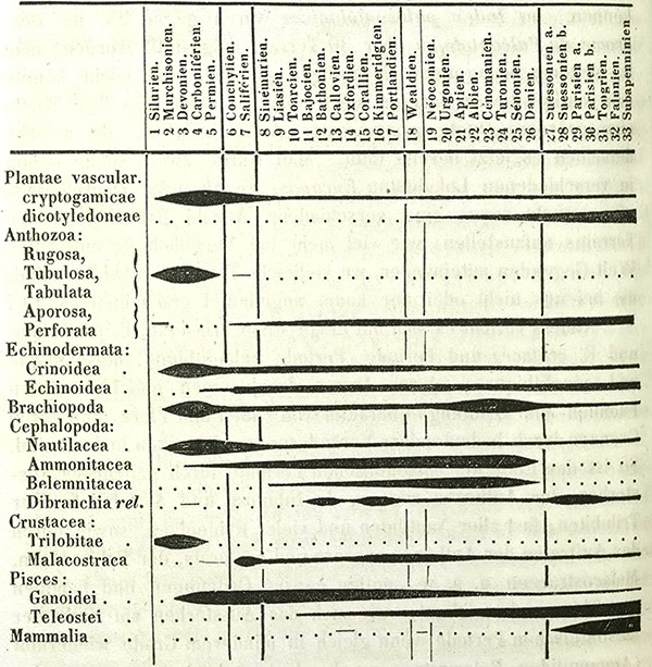
David Sepkoski has published a nice essay in Aeon about What a fossil revolution reveals about the history of ‘big data’. Sepkoski talks about his father (Jack Sepkoski), a paleontologist, who developed the first database to provide a comprehensive record of fossils. This data was used to interpret the fossil record differently. The essay argues that it changed how we “see” data and showed that there had been mass extinctions before (and that we might be in one now).
The analysis that he and his colleagues performed revealed new understandings of phenomena such as diversification and extinction, and changed the way that palaeontologists work.
Sepkoski (father) and colleagues
The essay then makes the interesting move of arguing that, in fact, Jack Sepkoski was not the first to do quantitative palaeontology. The son, a historian, argues that Heinrich Georg Bronn in the 19th century was collecting similar data on paper and visualizing it (see spindle diagram above), but his approach didn’t take.
This raises the question of why Sepkoski senior’s data-driven approach changed palaeontology while Bronn’s didn’t. Sepkoski junior’s answer is a combination of changes. First, that palaeontology became more receptive to ideas like Stephen Jay Gould’s “punctuated equillibrium” that challenged Darwin’s gradualist view. Second, that culture has become more open to data-driven approaches and the interpretation visualizations needed to grasp such approaches.
The essay concludes by warning us about the dangers of believing data black boxes and visualizations that you can’t unpack.
Yet in our own time, it’s taken for granted that the best way of understanding large, complex phenomena often involves ‘crunching’ the numbers via computers, and projecting the results as visual summaries.
That’s not a bad thing, but it poses some challenges. In many scientific fields, from genetics to economics to palaeobiology, a kind of implicit trust is placed in the images and the algorithms that produce them. Often viewers have almost no idea how they were constructed.
This leads me to ask about the warning as gesture. This is a gesture we see more and more, especially about the ethics of big data and about artificial intelligence. No thoughtful person, including myself, has not warned people about the dangers of these apparently new technologies. But what good are these warnings?
Johanna Drucker in Graphesis proposes what to my mind is a much healthier approach to the dangers and opportunities of visualization. She does what humanists do, she asks us to think of visualization as interpretation. If you think of it this way than it is no more or less dangerous than any other interpretation. And, we have the tools to think-through visualization. She shows us how to look at the genealogy of different types of visualization. She shows us how all visualizations are interpretations and therefore need to be read. She frees us to be interpretative with our visualizations. If they are made by the visualizer and are not given by the data as by Moses coming down the mountain, then they are an art that we can play with and through. This is what the 3DH project is about.
From a Humanist note I came across the fine essay on virtual reality, The Promise and Disappointment of Virtual Reality. It starts and ends with Plato’s cave and the responsibility of those freed from the cave to go back in and help others. Alas the state of VR technology doesn’t yet seem good enough to free us from reality and in this case the reality of VR is the commercialism of it.
But Plato’s Cave presupposes that those freeing the prisoner from their chains to reveal the true nature of “reality” are altruistic in their intent—that the world being shown the freed prisoners is indeed the truth. It is an allegory that does not allow for the world as it is today, or the pervasive desire to escape it.
The continued commercial failure of VR may represent an unconscious resistance to jettisoning our connection to the real. Maybe we are waiting for that blockbuster game to drive mass-market appeal. Perhaps the technology simply is not good enough yet to simulate a truly authentic—and profitable—experience. In this sense we are trapped. We crave authenticity of experience but, despite the efforts of philosophers, authors and auteurs, our imaginations appear limited to what we can individually consume and identify with. While capitalism lumbers on, we cannot see anything but the shadows on the wall.
What is nice about this essay by Mark Riboldi is the tour of the history of virtual reality technologies and dreams. What he doesn’t talk about is the sense of disappointment when the first generation of VR didn’t live up to the hype. I remember in the 1990s believing in VR (and lecturing on it.) When it proved clunky and nausea-inducing I felt let down by technology. Perhaps I and others had dreamed too much into VR led on by novels like Neuromancer. I was convinced VR was the logical next thing after the GUI. We had gone from a one-dimensional calligraphic screen to a two-dimensional desktop … wasn’t the three-dimensional virtual world next?
It is also worth mentioning that there have been a number of people writing about gender differences in how VR technology affects us. See Closing the Gender Gap in Virtual Reality. The technology seems to have been designed for men and calibrated to the male experience of reality.
Pour continuer le dialogue, on gagnerait à faire converser Hermeneutica avec des théories de la lecture comme celle d’Umberto Eco ou avec l’esthétique de la réception, représentée par Hans Robert Jauss et Wolfgang Iser. Aux yeux d’Umberto Eco (Lector in fabula), il n’y a à interpréter que là où le texte se tait. Ce sont tous les lieux d’ambivalence, les propositions implicites et les vides de l’œuvre, suscitant la coopération d’un lecteur qui met du sien dans le texte pour combler les blancs, qui font le propre du fonctionnement littéraire. Wolfgang Iser (L’Appel du texte) affirme de son côté que, loin de déduire le sens d’une œuvre de ses mots les plus utilisés, « l’essentiel d’un texte est ce qu’il passe sous silence ».
How can we analyze the gaps, the silences, or that which has not been written?
I finally got around to downloading and playing Rez Infinite on the PS4. This is an upgraded (hi-res) version of the original which SEGA released for the Playstation 2 and Dreamcast in 2001. The game is a beautiful rail shooter and a music game which produces trance like electronic music (and vibrations) as you play. There is a traveller mode where you don’t die and you can just make music and travel through the spaces. I found myself wanting to repeat levels to continue the beat.
The new 2016 version for the PS4 support VR (though I don’t have it). It also has an extra level called “Area X” which, while more sophisticated, lacks the charming Tron-like graphic imagination of the rest. It would be interesting to map all the references to Tron in Rez – it too places you as a hacker going through a computing landscape.
Polygon has a story on the Rez producer Tetsuya Mizuguchi on his return to music games. The story mentions a Synesthesia Suit (PDF) created to go with VR games like Rez Infinite. Below is a video from Siggraph 2016 to show (feel) of the suit’s capabilities. I’m intrigued by this intersection of art and game around music.
Eder has a nice page about the work he and ogthers in the Computational Stylistics Group are doing. In the workshop sessions I was able to attend he showed us how to set up and run his “stylo” package (PDF) that provides a simple user interface over R for doing stylometry. He also showed us how to then use Gephi for network visualization.